How to modernise Craigslists experience without wrecking its efficiency?

CLIENT School project

ROLE UX/UI

SOFTWARE Sketch, Overflow, Photoshop

DURATION January 2019

In collaboration with Morgane Thomas

Context / Brief

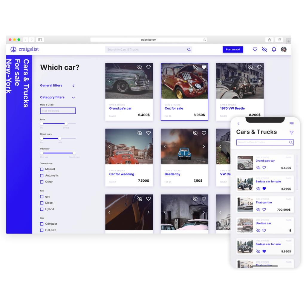
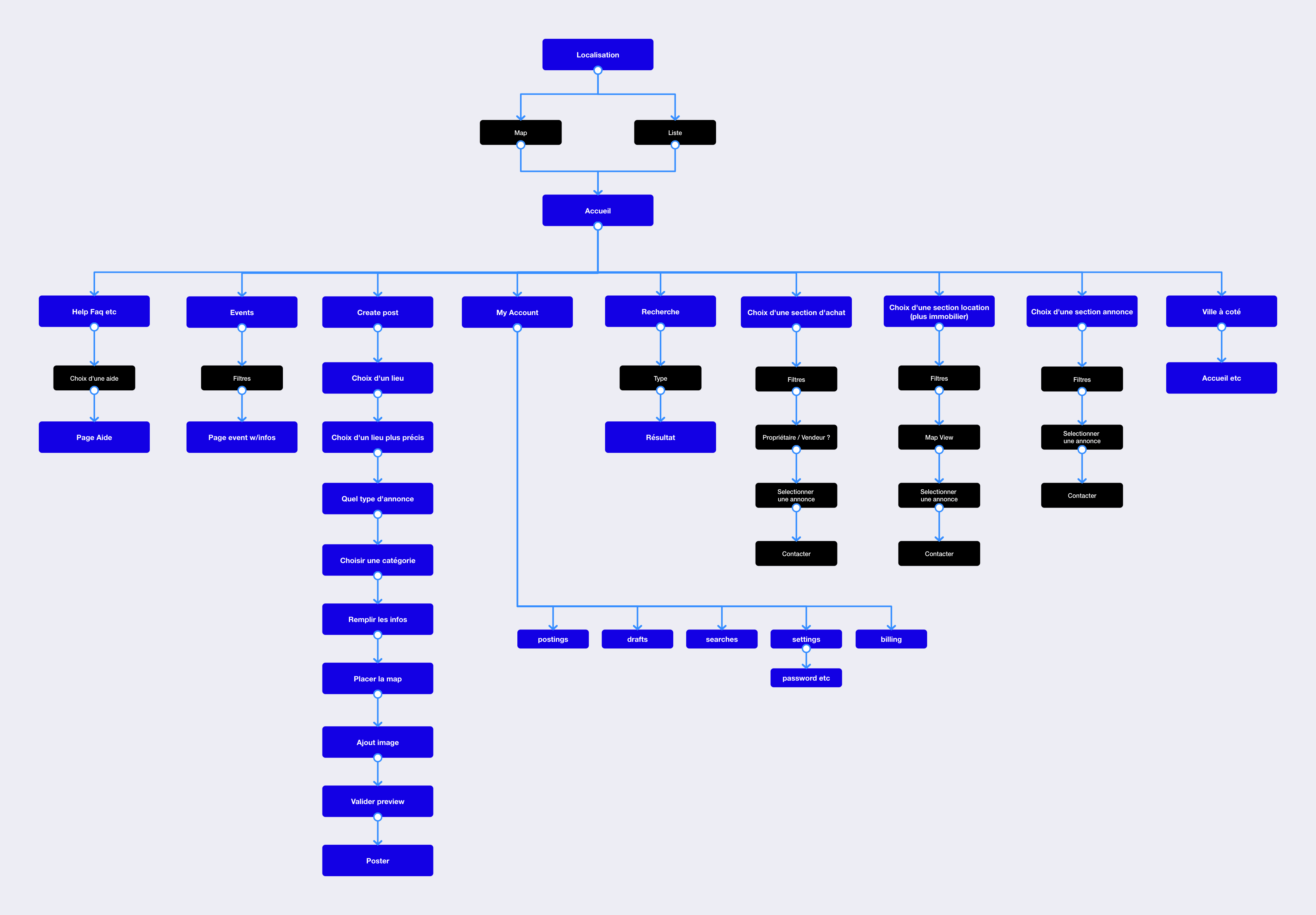
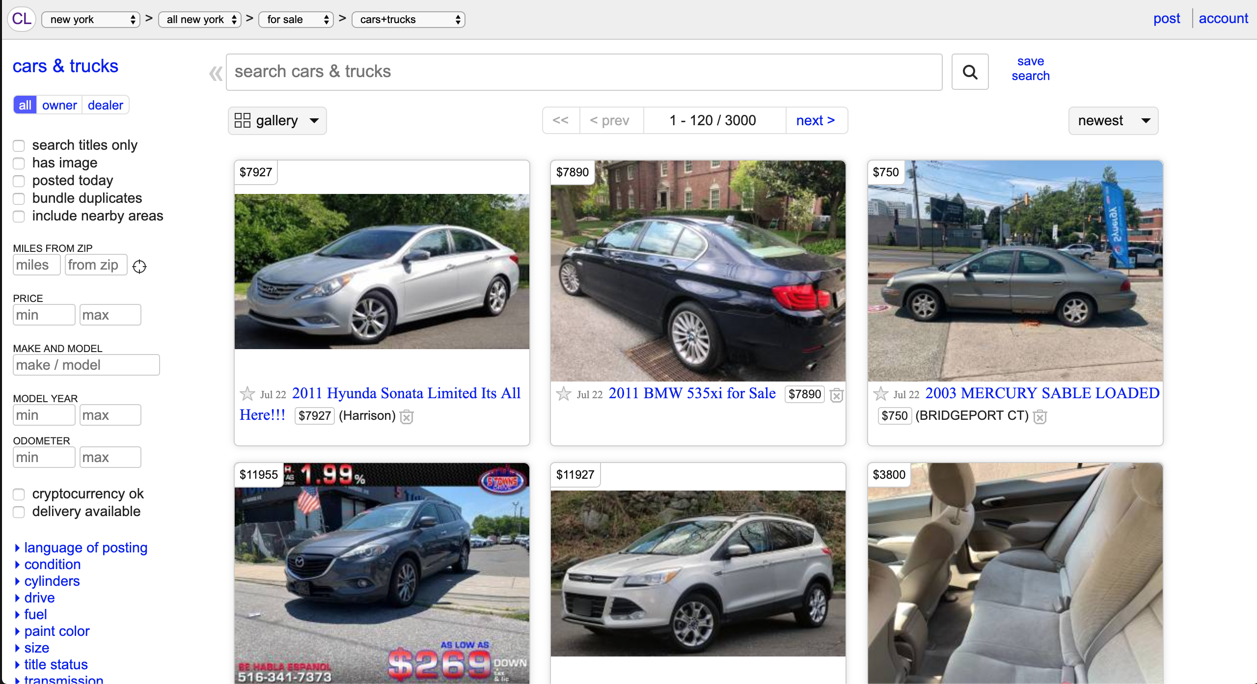
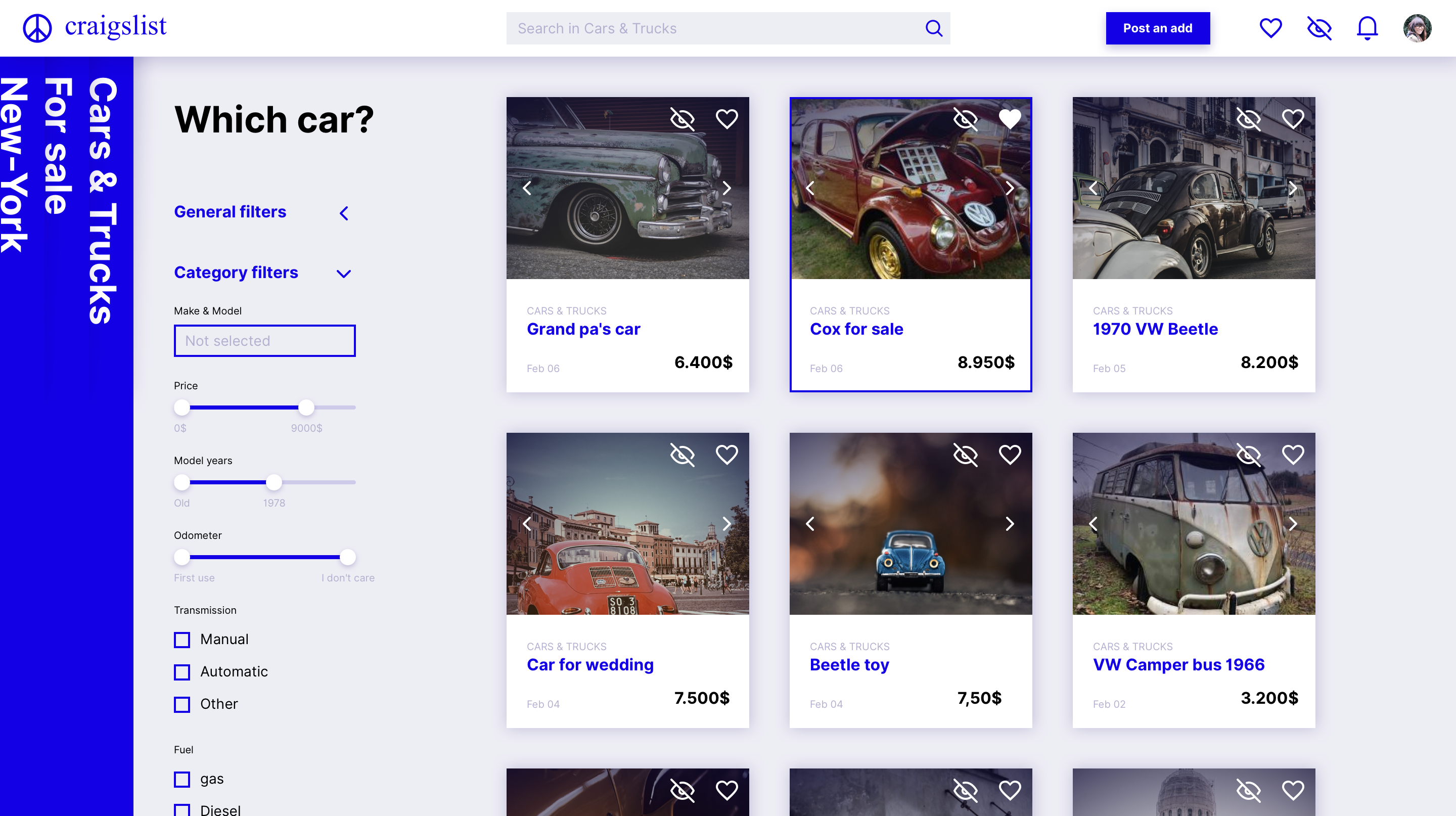
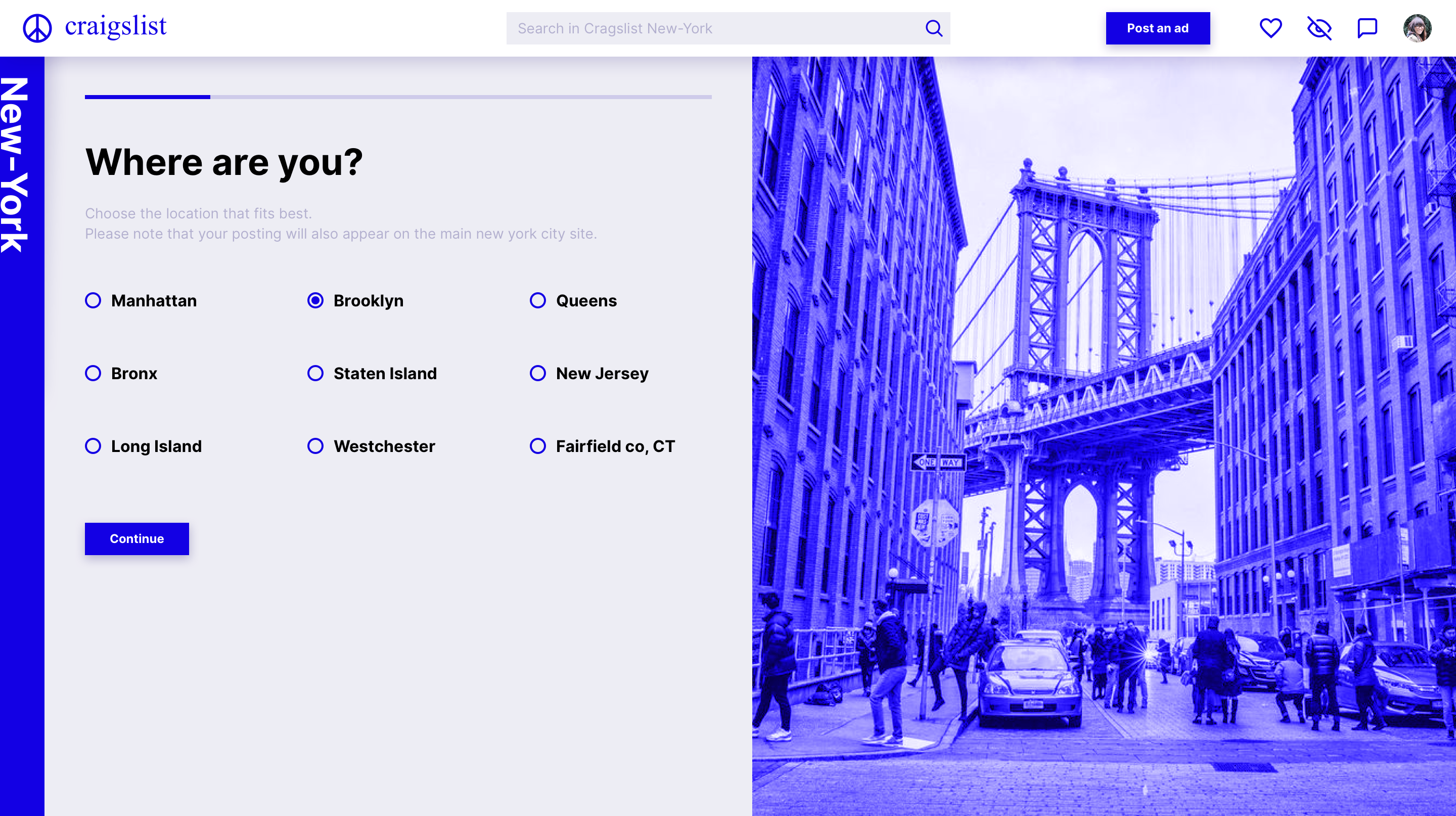
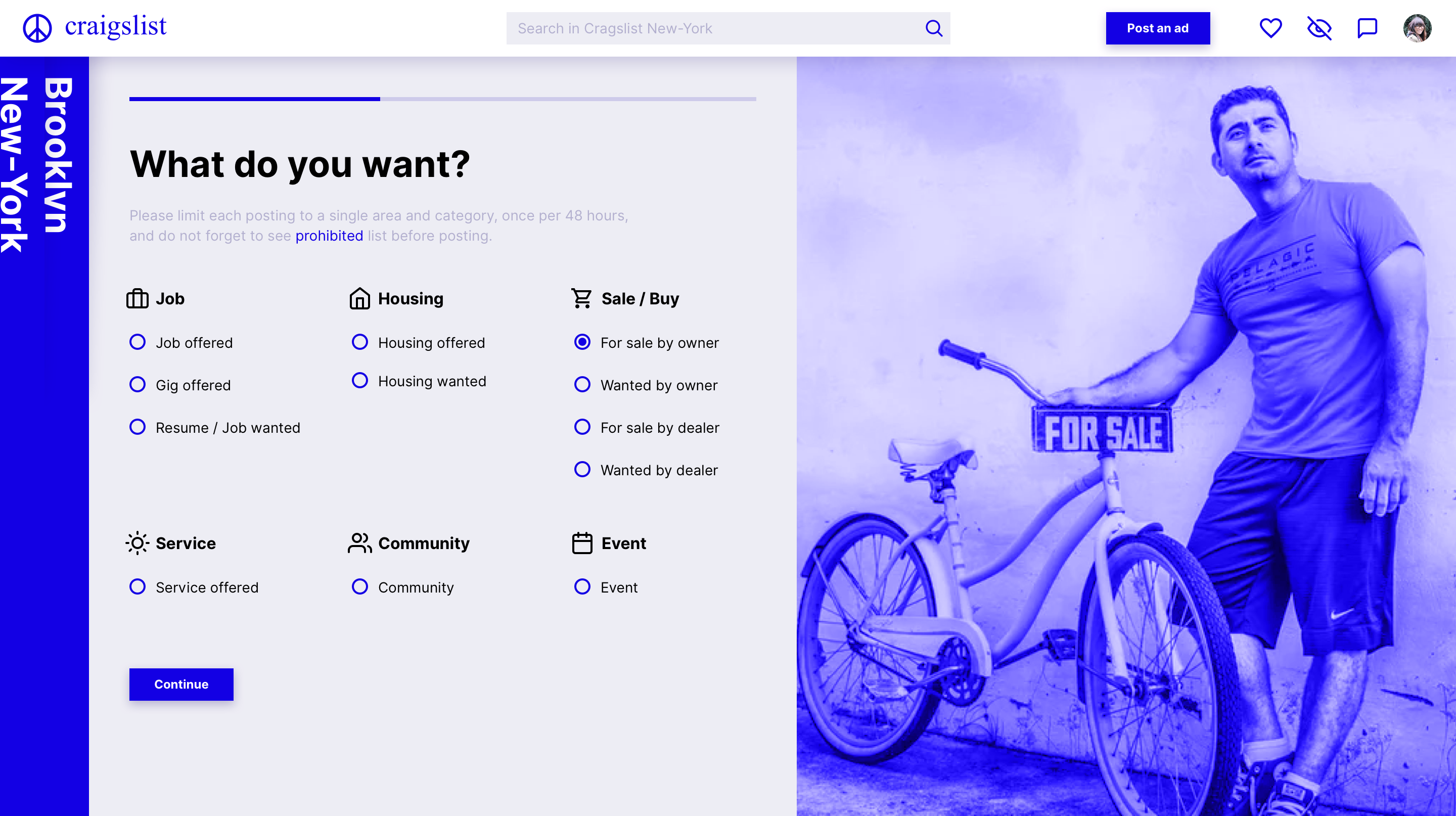
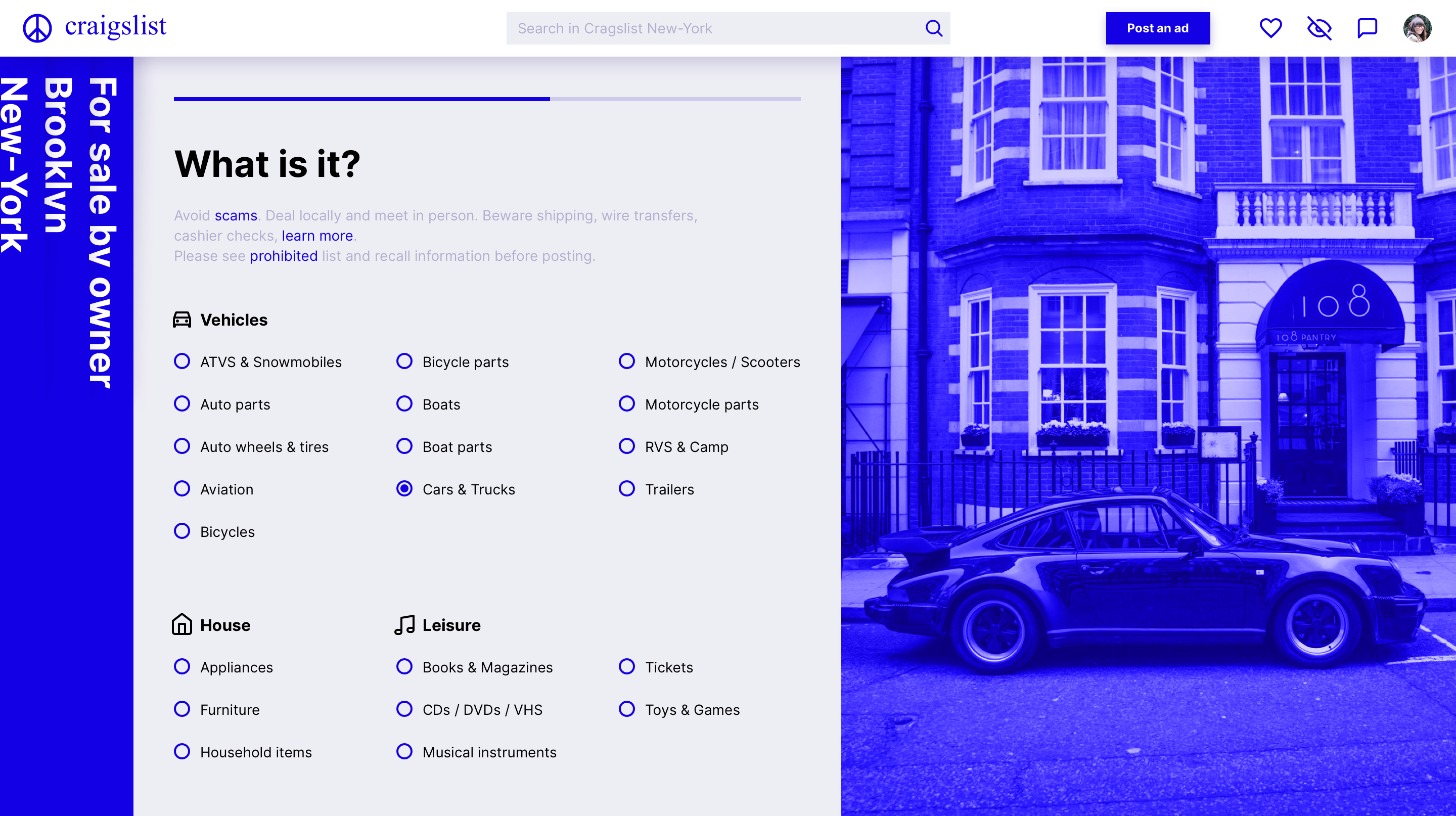
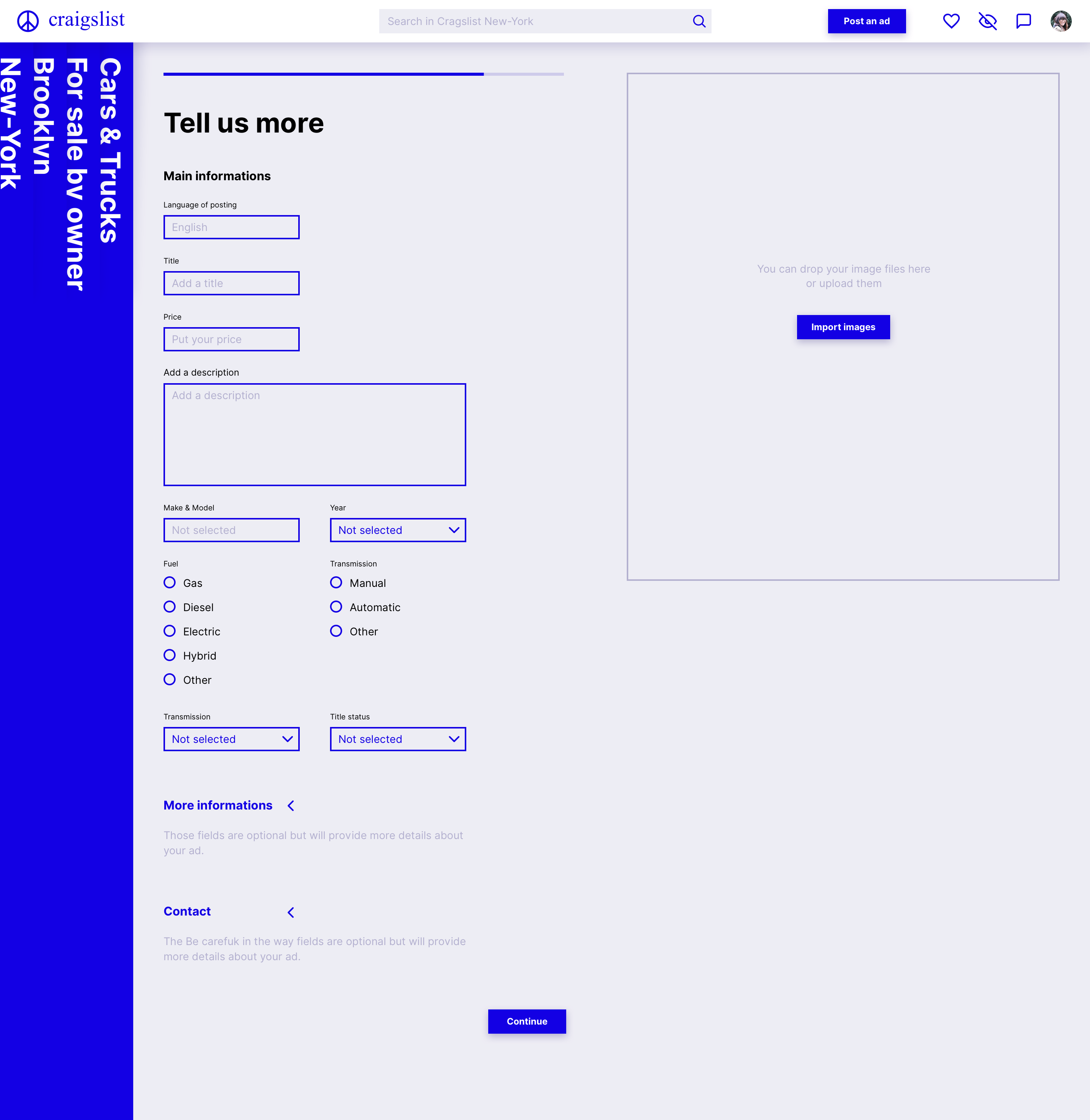
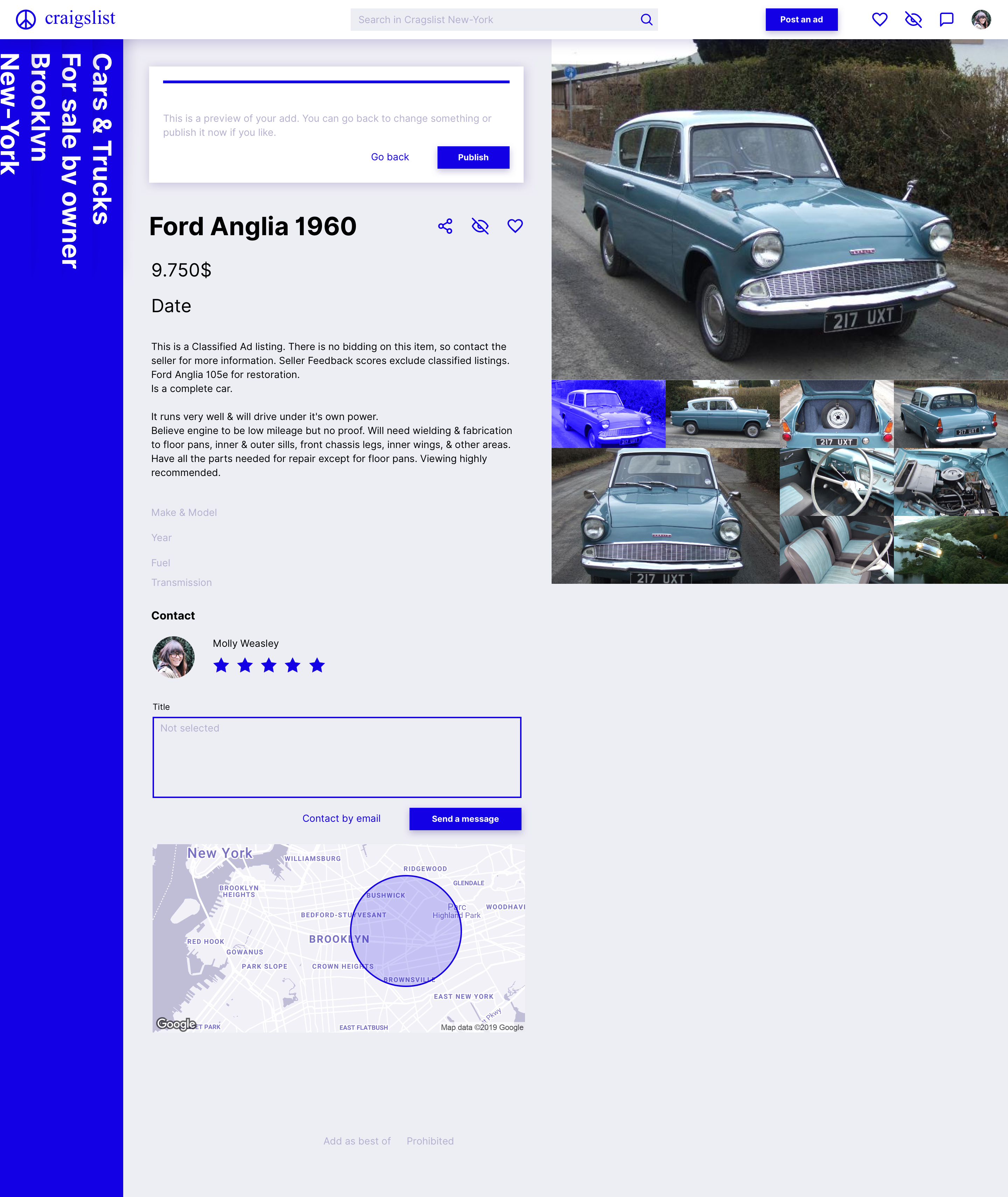
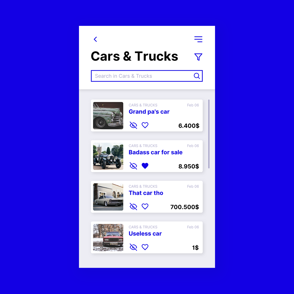
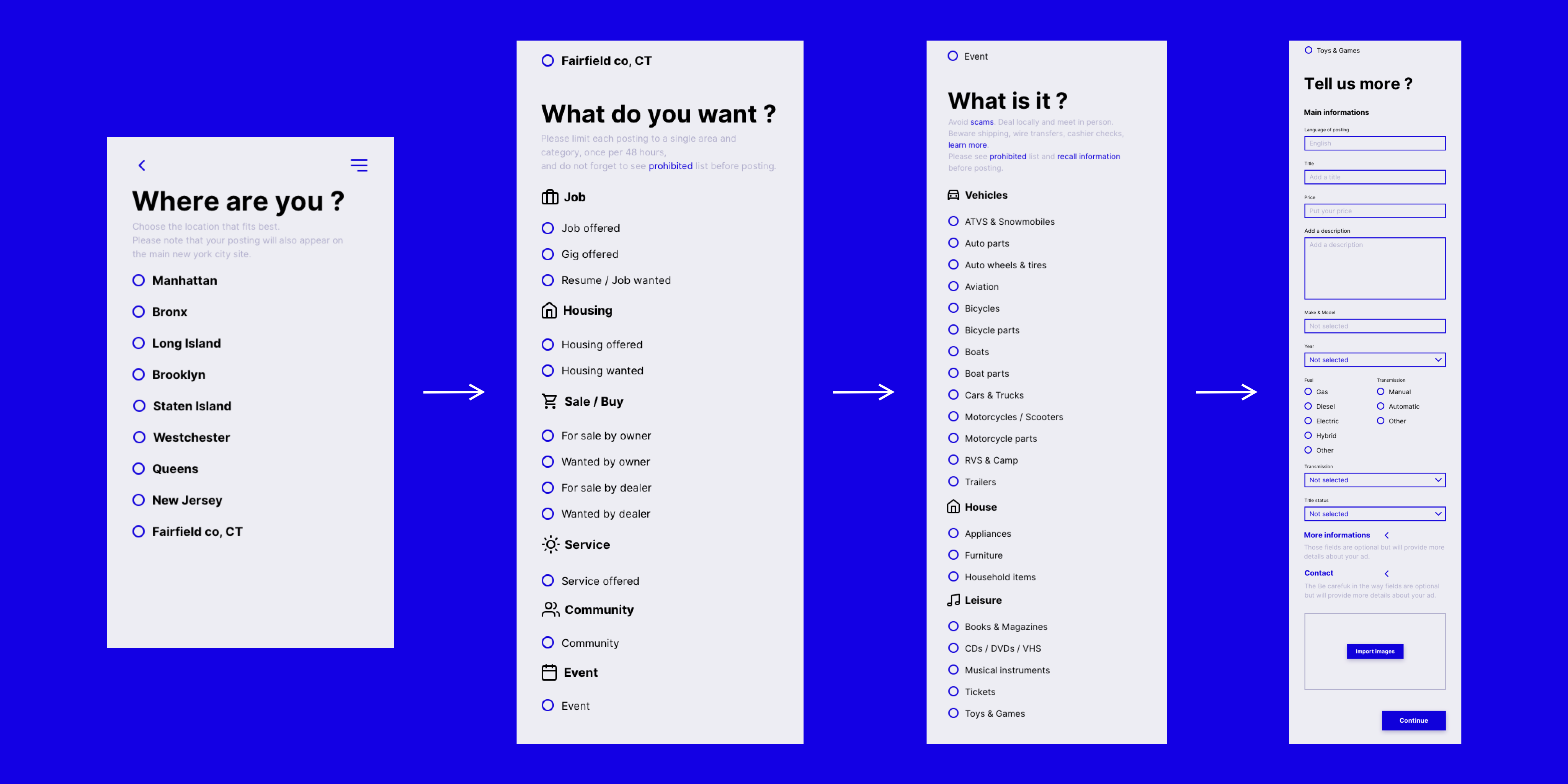
For a quick 4 weeks project, I teamed up with a classmate and we had to randomly pick a website. We got Craigslist, and we had to redesign the «posting an ad» scenario.
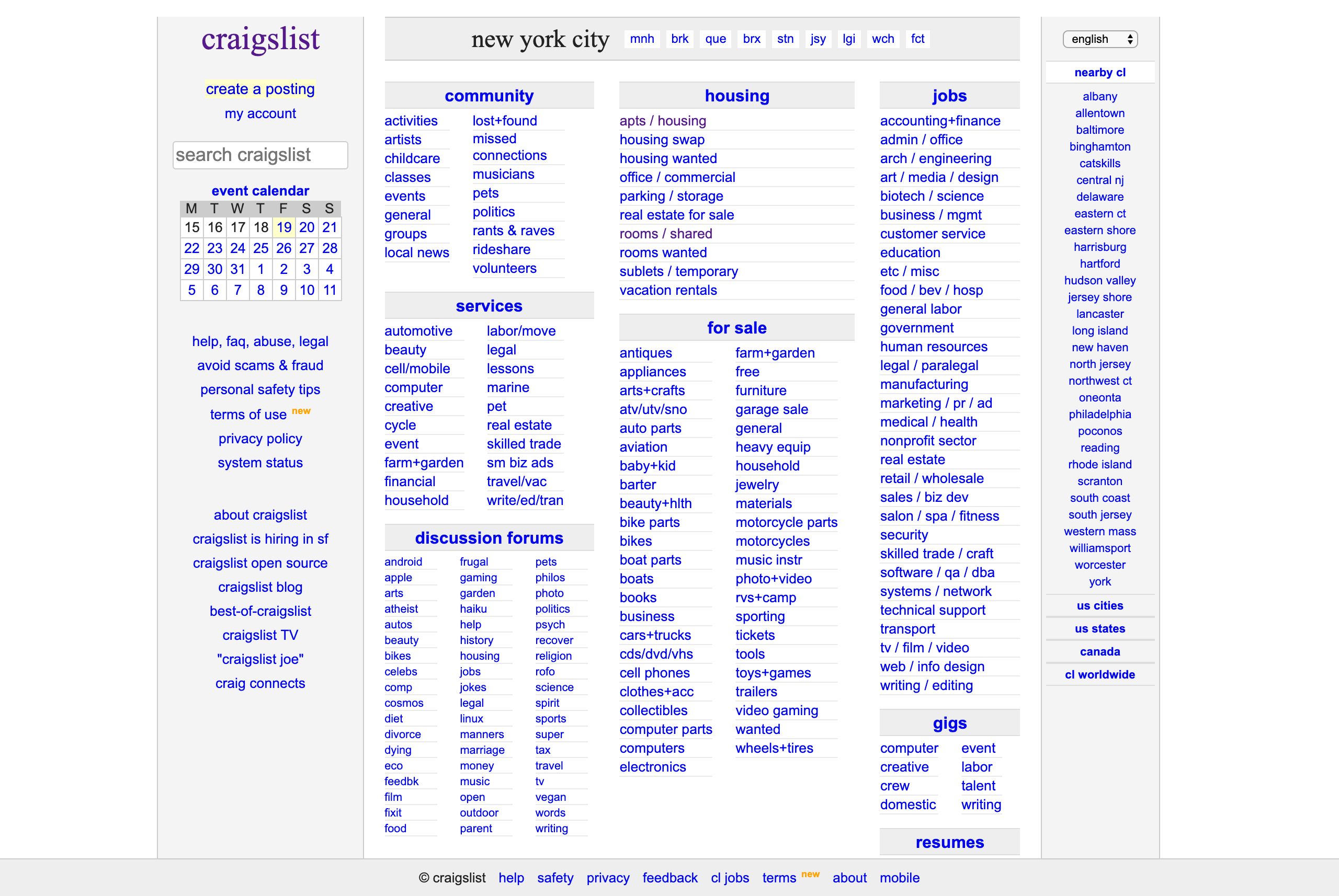
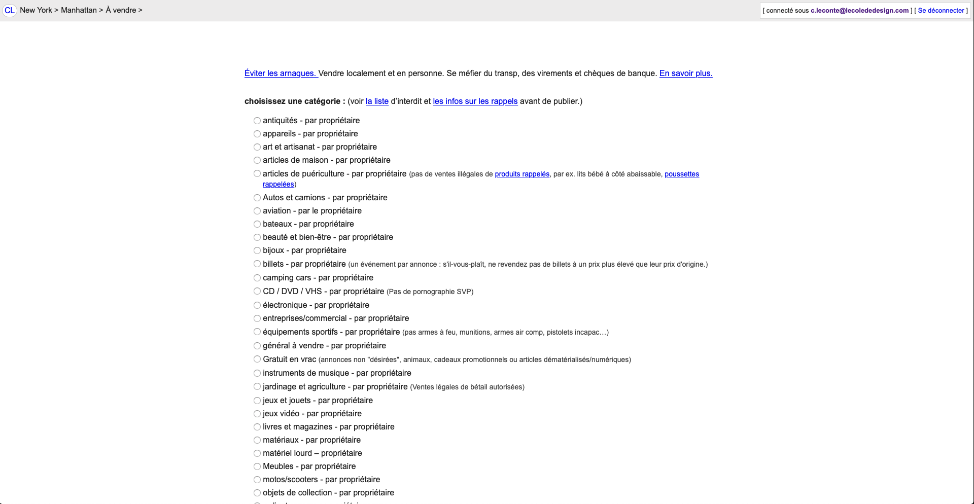
Craigslist is quite the UFO. It’s indeed not the prettiest website out there. Since it’s launch in 1995 it’s practically the exact same. But that’s also what makes it so efficient, it never changed, a person could be in a coma from 1998 to 2008 and still use Craigslist like nothing happened. We still redesigned the scenario to make it a bit more modern and efficient, but without changing too much the experience since we don’t want to repel old users with their habits on the service.

To better understand what we were dealing with, with first established Craigslists overall architecture. It looks complex but in the end it’s pretty straight forward. 

Overall Craigslist architecture

The scenario we had to redesign was the posting an ad one. By trying to post something on Craigslist we found out that the process was quite long and messy. It was a succession of 8 different steps, one page at a time. The pages themselves weren’t really appealing, sporting the famous Craigslists HTML without CSS kind of look. 
A breadcrumb trail is displayed on the top left section of the pages telling you where you are at the moment. But it was too discreet and it took us some time before actually acknowledging it.

Exemple of a page to post an ad

Redesign

As a start, we chose to work on the cars & trucks section and its page was the first thing we redesigned. Overall it works the same, we just tried to simplify the whole thing by improving the UI.
One thing we added was the possibility to like or hide a product. If needed you can find what you liked or hid on the right side of the header.
Besides from that you can find the filters on the left and the list of product on the right. 

Original product page
Redesigned

After that the whole purpose of our redesign was to simplify the process (and make it better looking). The goal is to reduce the 8 steps process. At this stage the user already informed in which city he’s searching for a product, being in New-York here he has to choose a more precise location.  
To keep the user informed of what’s left to do on the process there’s a progression bar right above “Where are you”.

Then the user has to choose what kind of ad he wants to post. In this particular case, it’s for sale by an owner. 
On the left side of the screen there a tab that goes over all the previous steps the user have already achieved. At any given moment, he can go back and change an information.

What kind of product the user want to sell, in this case Cars & Trucks.

Right after the user has to fill in all the informations about the product he wants to sell. Title, price, pictures etc.

Once he filled all the informations, he can check the preview of the ad to see if everything is right. If not he can go back to change any informations. If it’s all good, he click on Publish and voila !

From an 8 steps process to a 5 steps one with visual help, the approach is simpler, clearer and more user friendly.

Mobile version

As a part of our research phase, we posted an ad on Craigslist asking users what was lacking on the service according to them. One of the answers that we had quite often from the younger users is the fact that there is no official Craigslist app on iOS or Android. 
That is why we tried to adapt our redesigned scenario for a mobile use.

The process starts the same way, the post an ad button is in the burger menu in the top right section of the screen.

Then we find the same succession of steps, except it works a bit differently.
Indeed the form is one long page. Once you clicked on Brooklyn for instance, the following part of the from will appear and so on and so forth. It allows the user to modify anything he wants by just scrolling up the form.

Once the from validated, he access the preview of his ad juste like on the desktop version.

Overall

Redesigning Craigslist was quite the experience. I really enjoyed searching all about the history of the website and reading articles about why Craigslist UX is actually great despite his looks. By browsing through it I do agree. It’s indeed a bit confusing at first but once I got the hang of it, it was pretty straight forward. 
Still I think that Morgane and myself improved the exprience a little bit with our redesign. The process of posting and ad is quicker and clearer, which is quite important since the ad system is the most important thing in Craigslist.