Identity and website
redesign

CLIENT ACPA and NEC (Athletic associations)

ROLE UX/UI, art direction

SOFTWARE Photoshop, Illustrator, XD, WordPress

DURATION July – October 2018

Brief

This project was the first I received during my internship at Altran, and it ended during my last week there.

First of all I have to explain what kind of project it was. It was under a category of project in Altran called “mécénat de compétences”. Basically it’s when Altran chooses an association or an institute and offer to do a project for free. It was a great opportunity for me because it was a real project with real client but being pro bono we had the liberty to take our time and explore different ways of doing things. 

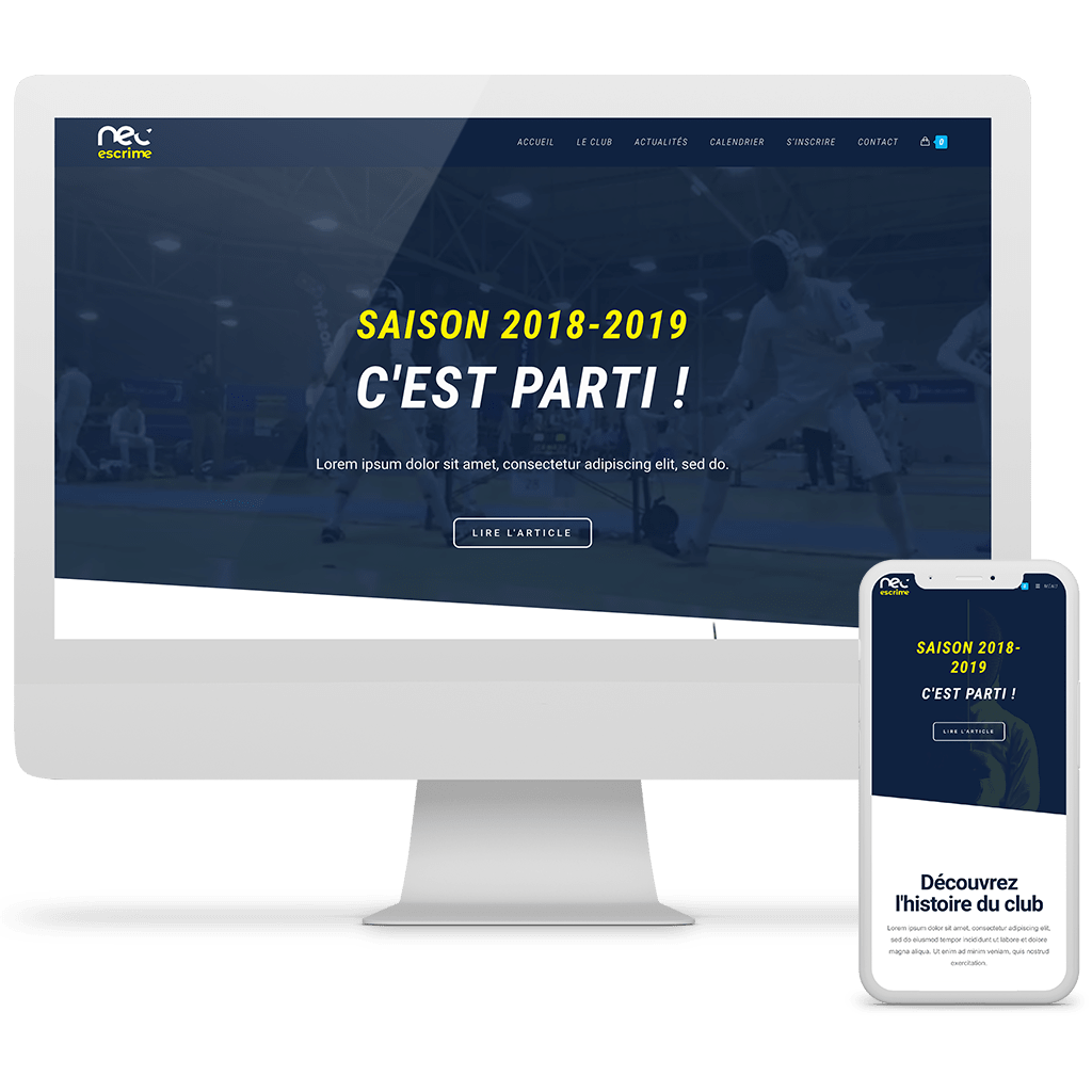
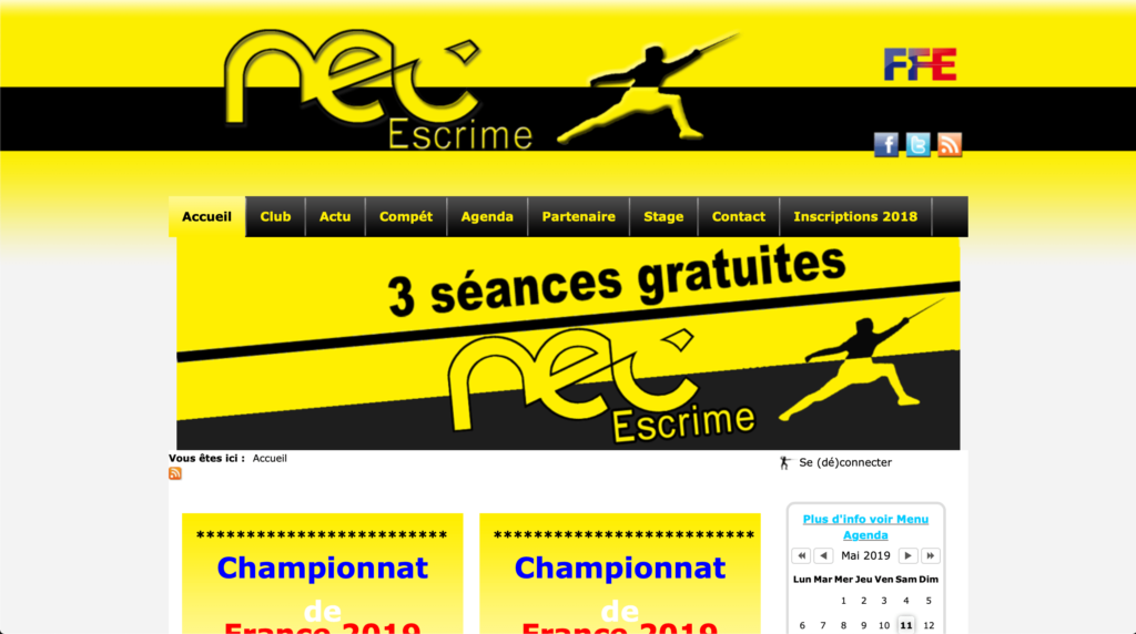
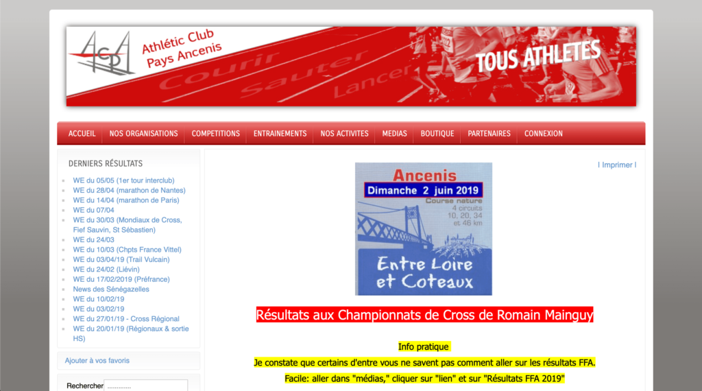
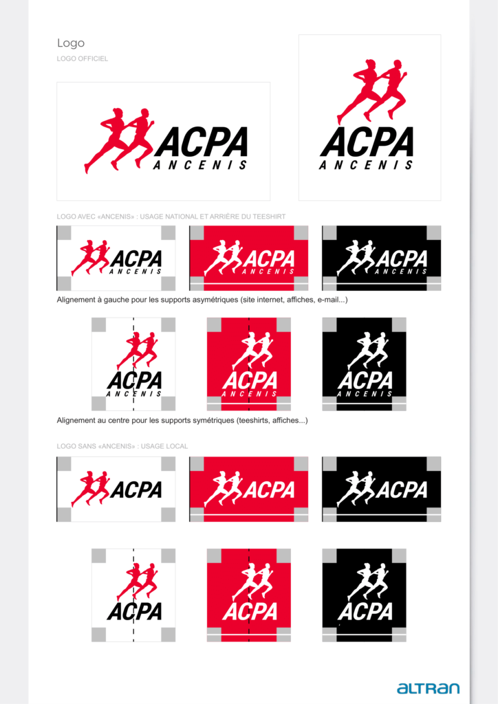
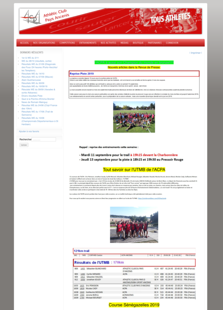
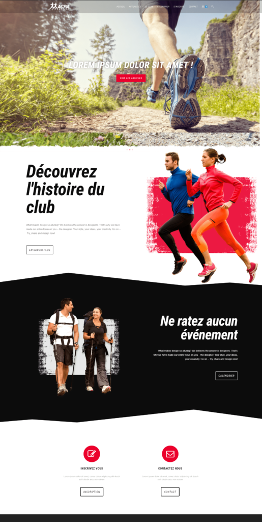
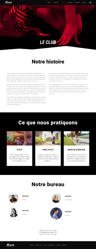
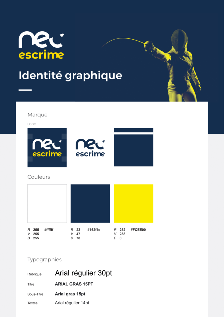
The ACPA is an athletics association based in Ancenis, a small town just outside from Nantes in France. And the NEC is a fencing association based in Nantes. 
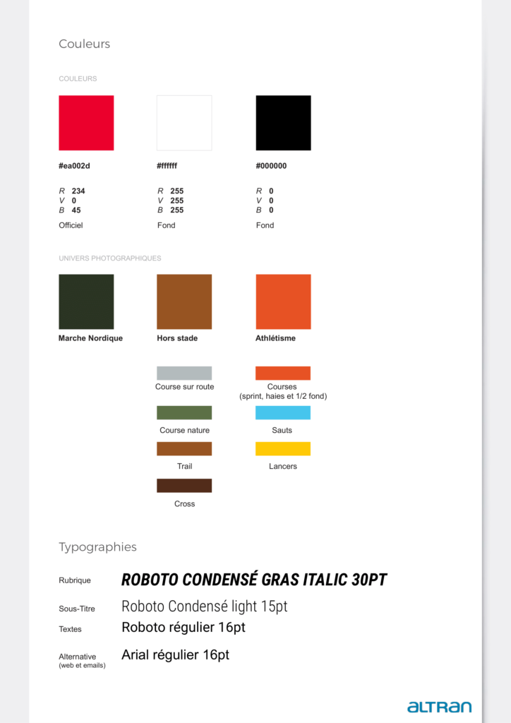
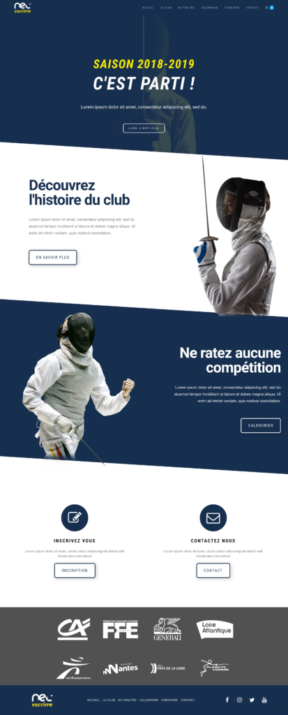
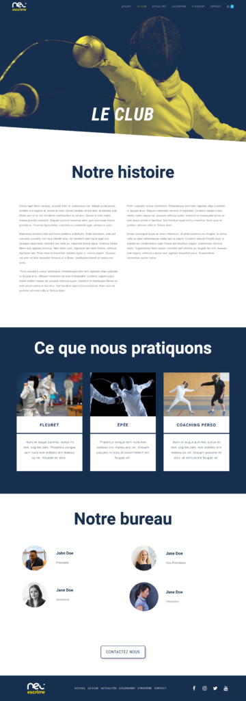
Both of them approached Altran because they needed a complete redesign of their identity in term of logos, websites, visuel identities standards, posters, letters template, business cards, jerseys, clothing…

Being neighborhood associations they never took the time to hire a designer to create a proper identity + website. 

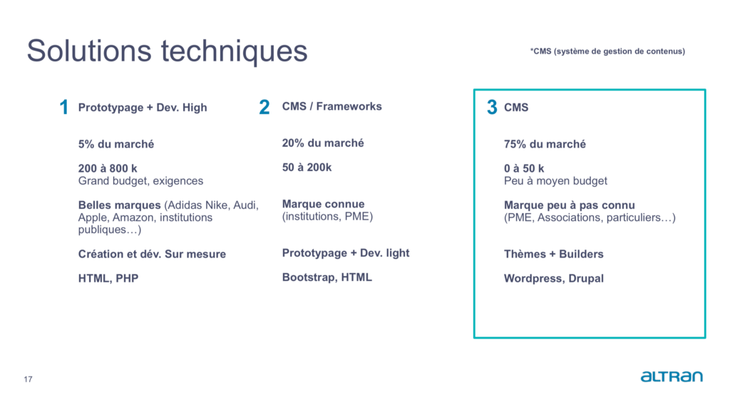
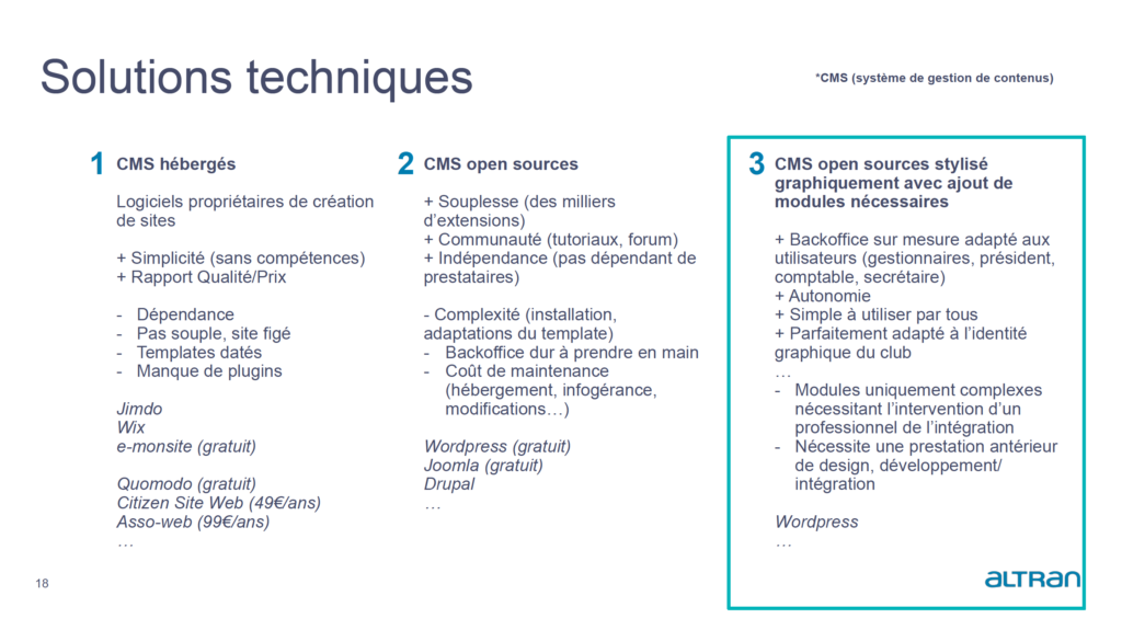
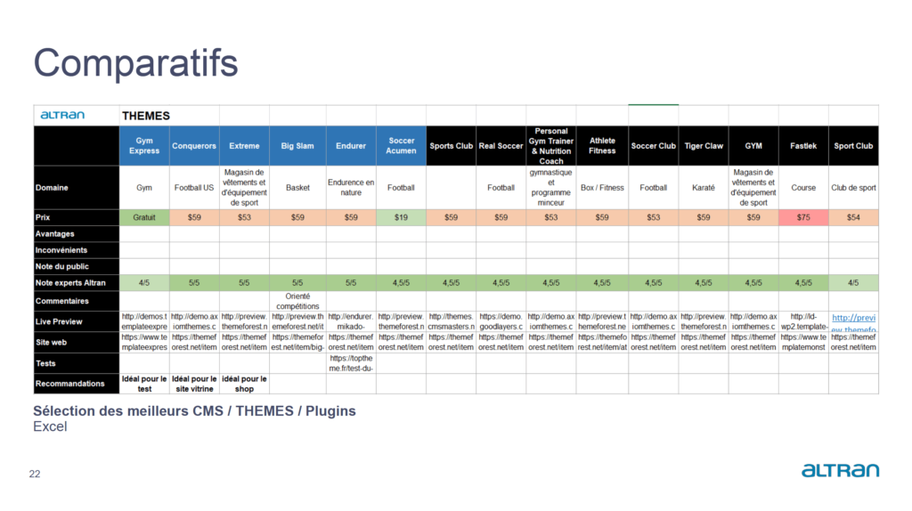
The main restraint we had was that they both wanted an original design (Not a template I mean by that) but with the ability to modify it themselves later. But they knew nothing about web design whatsoever.

The project being huge, I will only review the logo and website/identity redesign

ACPA / Logo

During this project, we shared our time between the two associations. The first part of the job we tackled was the ACPA logo. The existing one was quite old looking, hard to understand and the shapes and colors were merging together creating a complex shape.

In the end, we went for this design. The simplicity of it help understand what the association is all about, what the previous logo failed to achieve. 

Previous
New one

NEC / Logo

 For the NEC the redesign process was way quicker since we decided to just give a fresh look of the already existing logo. We removed the little fencer and flattened the whole thing a bit and applied the colors of their new identity.

Previous
New one

Website redesign

The main part of this whole project was the website redesign. As seen right under, their websites were quite old looking and belonged to another decade. They were running on an old version of Joomla.

Being old looking is a thing, but the navigation was confusing. There was way too much content all over the place. It wasn’t user friendly nor pleasant to use overall. Being sport association websites, a given user has to be able to arrive and find very easily the information he is looking for, it was really complicated with the original website.

We worked on a content sorting with both the associations to clear out the website a bit.


As explained earlier, the main goal for both of those websites was to create something fresh and that they could modify themselves later after the delivery.
That’s why the first thing we did with my art director Mathieu was to research what the best option was.

The first thing we had to decide was what was the right way to go. Either a fully HTML/CSS/JS written website (1 on the picture above), something with a bit less development like a HTML template (2), or a CMS with the right selection of plugins.

The first option is what we often find in major brands such as Audi, Nike or Adidas and it’s very pricy. Both of the associations didn’t have a lot of money to put in the website, that’s why the second option wasn’t right either. So we went for a CMS, because with enough resourcefulness we could create the whole thing for free.

We then searched for the best option in all the existing CMS.

It was mainly between services like Wix, Jimdo, and all thoses services that allows you to create a website for a small fee with a template. The interesting part was the ease of use, but it is a bit frozen. What I mean by that is that you start from a template and it’s complicated to create something unique and on demand. 

That’s why we went for WordPress. The fact that it was free was decisive in our decision. We settled for WordPress with a selection of plugins that were relevant in our situation.

We distinguished 3 possible roadmaps at that point. The first option was WordPress + a plugin to design our website + a plugin to manage the member of the association + an e-sale plugin to sell merch. The second and third one were services built to create websites specially for associations with everything in it (member management etc)

The big advantage of the first option was the obviously the price. We estimated the range between 0 and 50€ a month. Whereas the cheapest of the two other options was 77€ a month. The price of the solution was quite decisive since none of the two associations had a lot of money to put in their websites.

To back and explain our decision to the clients, we made this summary of the 3 options and rated them based on their price, simplicity, maintenance, was it available in french or not, popularity, public rating, are there tutorials or not, difficulty of setting the whole thing up etc. And rated the whole thing on 10.

The first option emerged quite naturally being the best one in our situation. The client chose that one. 

At that point we obviously had to compare all of our options for the plugins we wanted. So we made an Excel based on : the price, the advantages, the disadvantages, the public rating etc…

Now that we knew where we were going, we just had to determine how we wanted to organize everything between the plugins. All the design of the pages would be created thanks to the theme builder. 

The home page would disserve the register page managed by a plugin, the shop managed by an other etc.

We were now ready to tackle the main part : the actual website.

ACPA

I will review the ACPA redesign first and then the NEC.
We then started the work on the actual redesign. First of all we created their new identities.

We established their style guide with the brand new logo and proposed some new fresher colors. Indeed the original logo featured a washed out red, we thought that brighter one would communicate better about the energy of the association. 

The ACPA has 3 main activities : Nordic walking, trail and tracks. We separated those 3 activities with their own colors.   

Once we had all that part ready, we started working on the website.

We decided to simplify a whole lot the experience. We kept the home page obviously, then a actuality/blog page, a page dedicated to the history of the club, a calendar, a register page and a contact page. 

The home page purpose would be to highlight the activities of the club and guide the user where he wants to be.

Before
After

The previous version of their website was extremely messy, so the first thing we wanted to do is clear out the way a bit. 
The new version is a bit more modern, with free space to breathe. There’s CTA to guide a new user where he needs to be. The first one at the top right under the header leads to the blog to get to know more about the activities of the association, right under is to discover the history of the club, then the calendar and at the bottom you can either register or contact them. 

Here, we added a “the club” page which they didn’t have before.
It explains the whole history of the club, when it was created by who etc. A summary of what they do and the option to know more about it. Then the people working there, and finally a “Contact Us” CTA.

The other pages such as actuality, calendar or register run on different WordPress plugins so there’s no particular interest in presenting them.

NEC

When we received the brief, it was indicated that in order to save time, we could design the “same” website for the ACPA and the NEC. As you will see it’s quite the same. But something that we did for the NEC more than for the ACPA is the identity redesign. We proposed a whole visual and photographic identity which they lacked before.

I had the mission to choose and work on the photographic identity of the NEC. Inspired by Nike and Adidas, I want for something straight to the point. Very nice fencing pictures, a duotone treatment on them. Keeping it simple and classy. 

In term of the actual website, it’s pretty much the same as the ACPA but with the NEC identity and some details more appropriated to the fencing universe.

Before
After
Club page

Overall

I really enjoyed working on this project. It was my first “real one” with a client. The whole “mécénat de compétence” was good because we had the opportunity to take our time and explore different way of doing things. I also had the chance to directly present my work to our clients

One regret I have regarding the project is the fact that we had to build almost the same website for the two associations.

But overall it was a rewarding experience. I learned a lot in term of process. Taking the time to study all of our options, try them out, compare them, come to the conclusion that this was the best one and why etc. 

I learned a great deal and I had the chance to not only work as a UX/UI but also as an “art director” which was really great.