How to make reading easier and more engaging for children with dyslexia?
Introduction
Reading isn’t easy when you have dyslexia. Around 8% of children struggle with it daily, making even simple texts frustrating to navigate. That’s where Frog Reader comes in. It is a reading app designed to assist dyslexic children with tools like syllable highlighting, customizable fonts, and audio support.
The company behind it, Mobydis, had all the technical know-how to build a powerful tool. But there was a problem. The app wasn’t user-friendly at all. Kids weren’t using it because the interface was cluttered, confusing, and hard to navigate. That’s where they needed a bit of design.
Frog Reader had plenty of features to help with reading, but actually accessing and using them was another story. The main usability issues identified were:
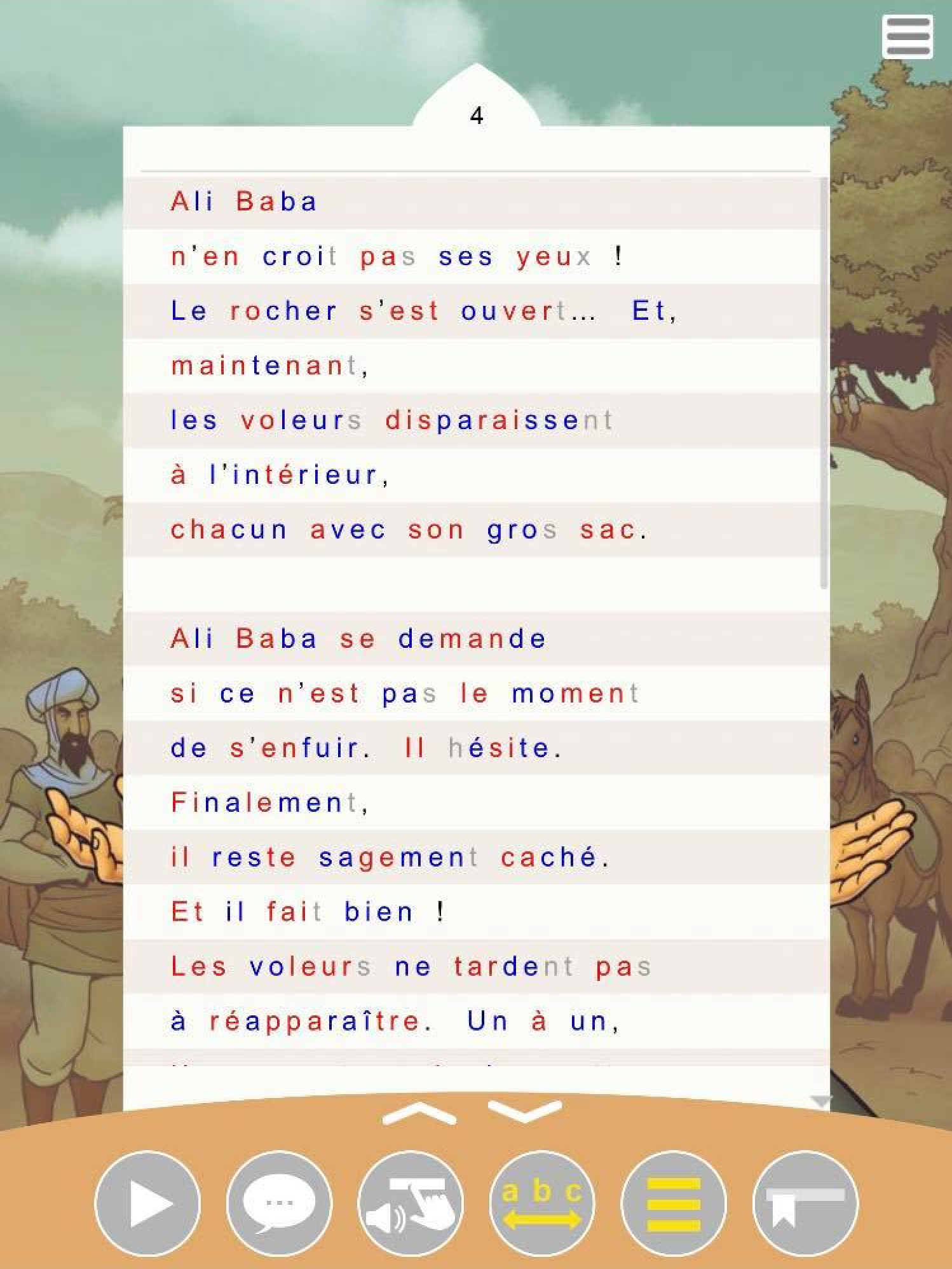
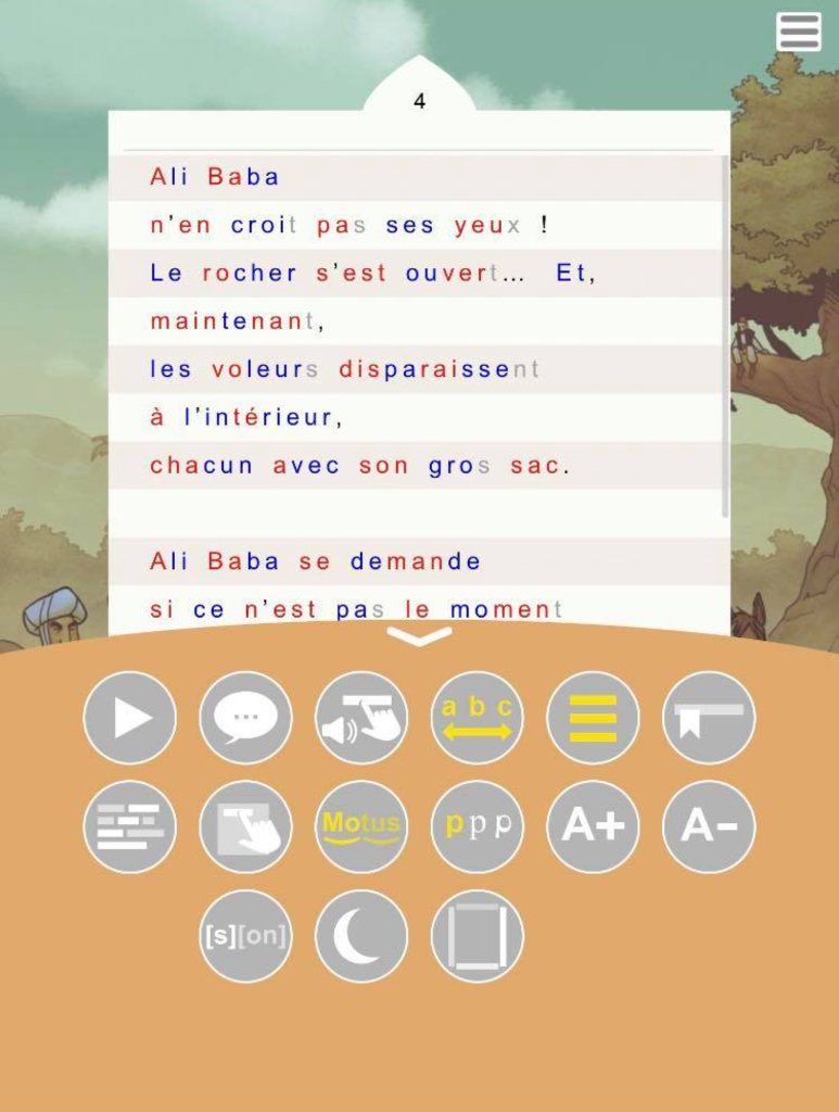
- Too much visual clutter. The app had large background illustrations behind the text. Nice in theory, but for dyslexic children who already struggle with focus, this was overwhelming.
- A chaotic feature selection screen. There were too many icons, no clear labels, and no real structure. It wasn’t obvious which tools did what, making the experience frustrating.
- Navigation that didn’t make sense. Kids had trouble figuring out where to go to enable or adjust the reading aids they needed.
As a result, the app wasn’t doing its job. Kids weren’t engaging with it, and teachers weren’t recommending it because it was too complex.
The goal was simple. Redesign the interface to make Frog Reader actually usable for the kids it was built for.
Research & insights
Designing for dyslexic children comes with unique challenges. Since dyslexia affects reading, focus, and information processing, even small design decisions can make a big impact. Before jumping into solutions, it was essential to understand what actually works for these users.
Mobydis had already done extensive research on dyslexia, and their expertise provided a strong foundation. In addition to that, feedback from educators and a group of schoolchildren helped pinpoint the key issues in the app’s usability.
Here’s what was gathered:
- Distractions make reading harder : Background illustrations, excessive colors, and too many UI elements were overwhelming. A clean, minimal interface was crucial.
- Sequential reading aids work best : Features like syllable segmentation, word-group highlighting, and dyslexia-friendly fonts significantly improved readability.
- Too many choices create friction : While customization can be helpful, an overload of options led to confusion. A more structured, guided approach was needed.
The biggest challenge was striking the right balance between functionality and simplicity. Frog Reader had powerful tools, but they weren’t accessible in a way that made sense for dyslexic children. The redesign needed to reduce cognitive load, improve navigation, and make features intuitive to use.
Imagine trying to read a sentence where the words seem to jump around or blur together. For children with dyslexia, this is a daily reality. Reading isn’t just slower, it feels like you’re constantly working to decode each word, often making the process tiring and frustrating. This struggle can make comprehension and enjoyment of the text very challenging. Understanding these difficulties was key to redesigning Frog Reader in a way that truly supports its young users.
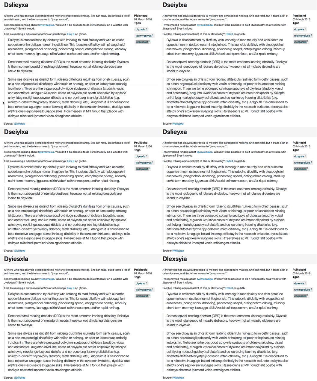
To make reading easier for dyslexic children, several strategies can be applied. Enlarging the text helps reduce visual strain, while using a dyslexia-friendly font improves letter differentiation. Adjusting spacing between lines and words prevents crowding, making it easier to follow along. Breaking words into syllables or highlighting phonemes provides clear reading cues, supporting word recognition. Tools like reading guides and text highlighting help maintain focus, while audio support allows children to follow along and reinforce word associations. By combining these features, reading becomes less overwhelming, improving comprehension and confidence.
Design process
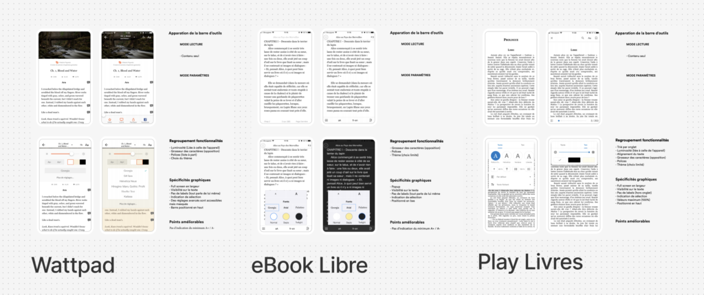
Before jumping into design, it was important to understand what already existed. A benchmark of reading apps and products designed for dyslexic children was conducted to identify best practices and common pitfalls. This helped highlight what worked well in other tools—and what Frog Reader needed to do differently.
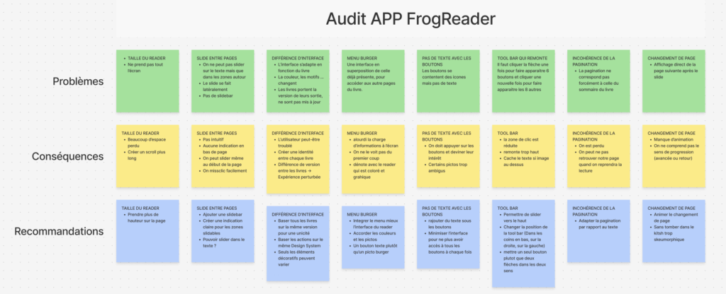
To structure the analysis of the existing app, a PCE framework (Problem → Consequence → Enhancement) was used. This method helped break down usability issues clearly:
- Problem : The feature selection screen was cluttered and unclear.
- Consequence : Users struggled to understand what each tool did, leading to frustration and abandonment.
- Enhancement : Restructure the interface with better iconography, clearer labels, and logical feature grouping.
By systematically evaluating these issues, the redesign focused on addressing the most pressing pain points with targeted solutions rather than surface-level improvements.
With a clearer understanding of the problem, three guiding principles shaped the redesign:
- Reduce cognitive load : Remove distractions and simplify the interface.
- Improve feature accessibility : Organize tools in a way that makes sense for dyslexic users.
- Make customization useful, not overwhelming : Provide enough flexibility without creating confusion.
These principles ensured that every decision focused on usability first.
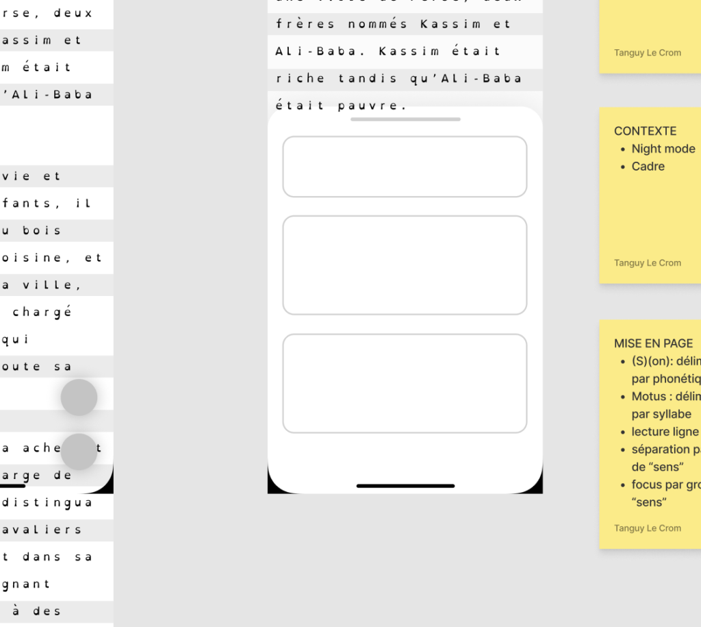
The first design phase involved wireframing different interface structures, testing ways to make navigation more intuitive. The biggest shift was the decision to separate the app into two modes:
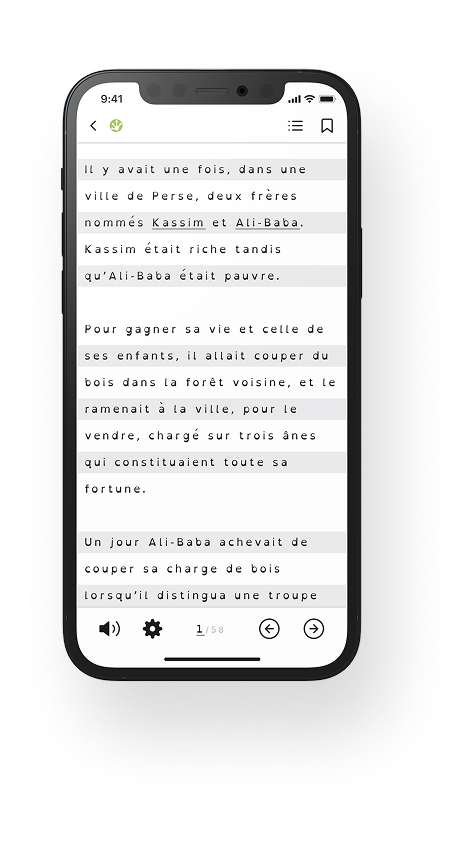
- Reading Mode : Minimal distractions, only essential tools like audio autoplaying
- Configuration Mode : All settings grouped into three clear categories: Text, Appearance, Concentration.
This approach prevented feature overload while keeping essential tools accessible.
Once the first prototypes were ready, they were evaluated with educators and Mobydis internal team. Feedback helped refine the design:
What worked : The two-mode system was praised for reducing confusion and making the reading experience smoother.
What needed improvement : Some labels and icons were still unclear. Adjustments were made to ensure all features were more affordable.
After several iterations, the final design balanced clarity, functionality, and accessibility. The result was a cleaner, more structured experience that dyslexic children could navigate with ease.
Product design & features
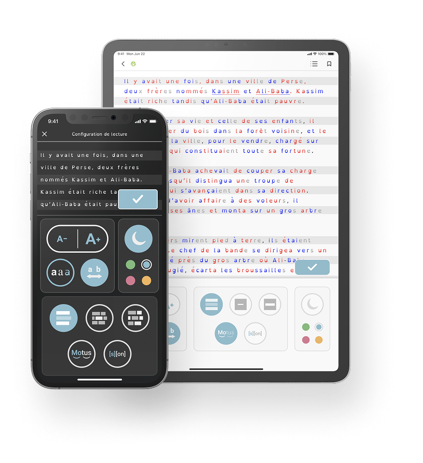
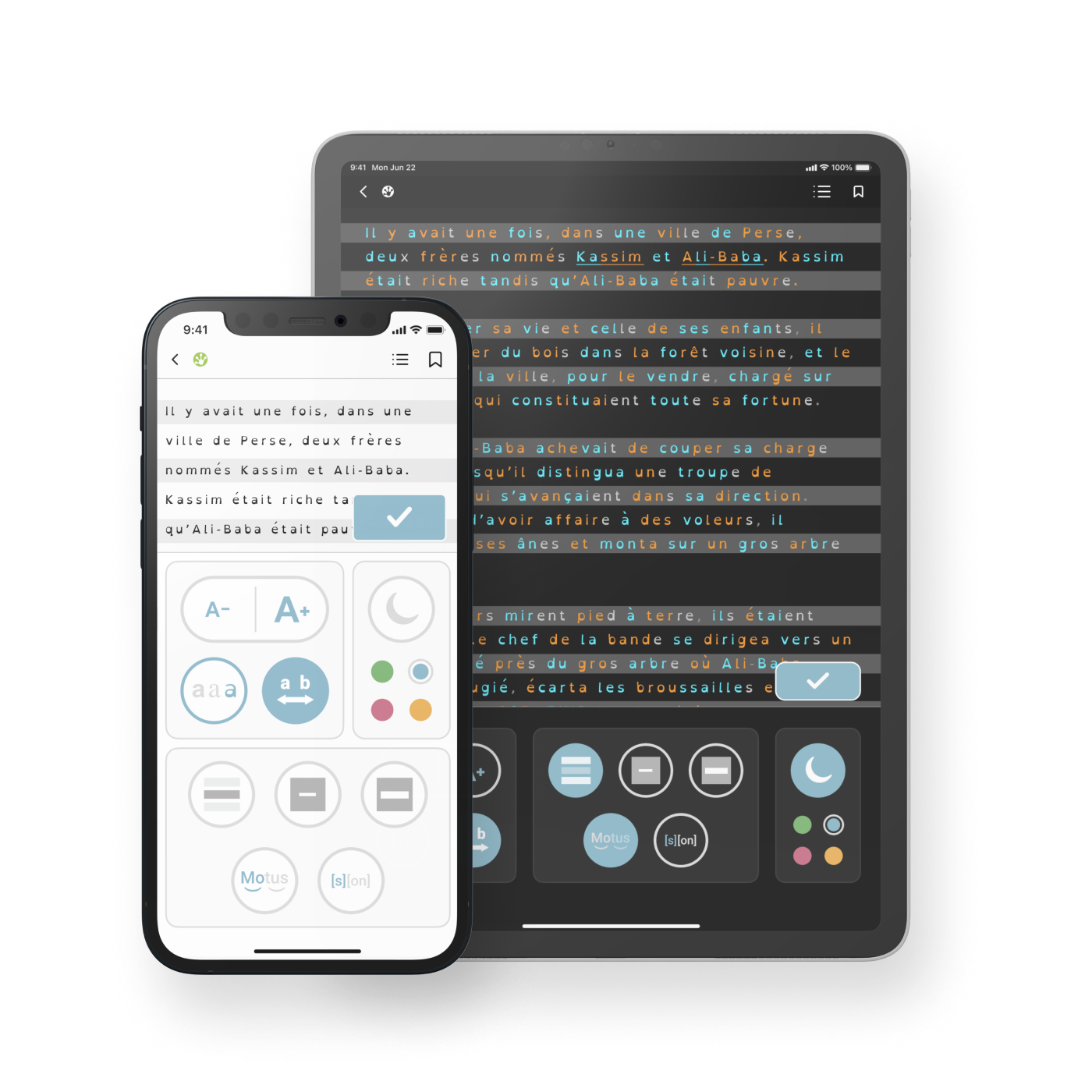
The redesign of Frog Reader focused on simplifying the interface and improving the reading experience without overwhelming users. The solution was built around two key ideas: reducing cognitive load and structuring features in a way that made sense for dyslexic children.
One of the biggest pain points in the original app was the cluttered interface. There were too many tools visible at once, making it difficult for users to focus on reading. The solution was to split the app into two distinct modes:
- Reading Mode – A distraction-free environment where only the essential features are accessible.
- Configuration Mode – A structured settings panel where users can adjust their reading preferences without interfering with the reading experience.
This separation ensured that users weren’t bombarded with options while trying to read, making the app easier to navigate and less cognitively demanding.
Another major change was the visual simplification of the interface. The original design featured large background illustrations, which, while visually appealing, added unnecessary cognitive load. These were removed in favor of a cleaner layout that kept the focus on the text.
Other improvements included:
Minimal color usage : Only a few accent colors were used to highlight important elements.
Clearer iconography : Redesigned icons made it easier to understand each feature at a glance.
Better information hierarchy : Key actions were made more prominent, while secondary options were tucked away to avoid clutter.
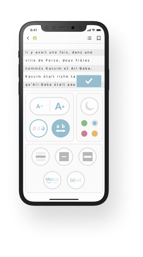
Instead of presenting all features in a single, overwhelming panel, the Configuration Mode grouped tools into three categories:
- Text – Options related to typography, font size, and spacing.
- Appearance – Settings for contrast, background color, and reading guides.
- Concentration – Tools like audio reading, word segmentation, and line highlighting.
By clustering features in a way that aligned with how users interacted with them, the app became more intuitive and easier to use.
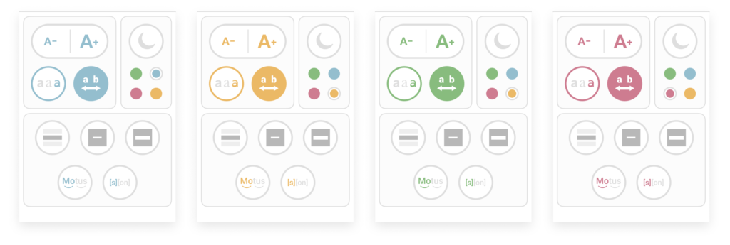
While customization is important, too many choices can lead to decision fatigue. Instead of offering endless options, the app provided a curated set of customization choices:
- A selection of four accent colors to personalize the interface without overwhelming users.
- Preset font and spacing adjustments optimized for dyslexic readers.
This approach gave users control without making the app feel complicated.
With the new structure in place, navigating the app became much more straightforward. Users could:
- Enter Reading Mode instantly and start reading without distractions.
- Access Configuration Mode when needed, with clearly labeled sections guiding them through available options.
- Preview changes in real time without switching back and forth between settings and reading.
By keeping navigation simple and predictable, Frog Reader became an app that children could use independently and with confidence.
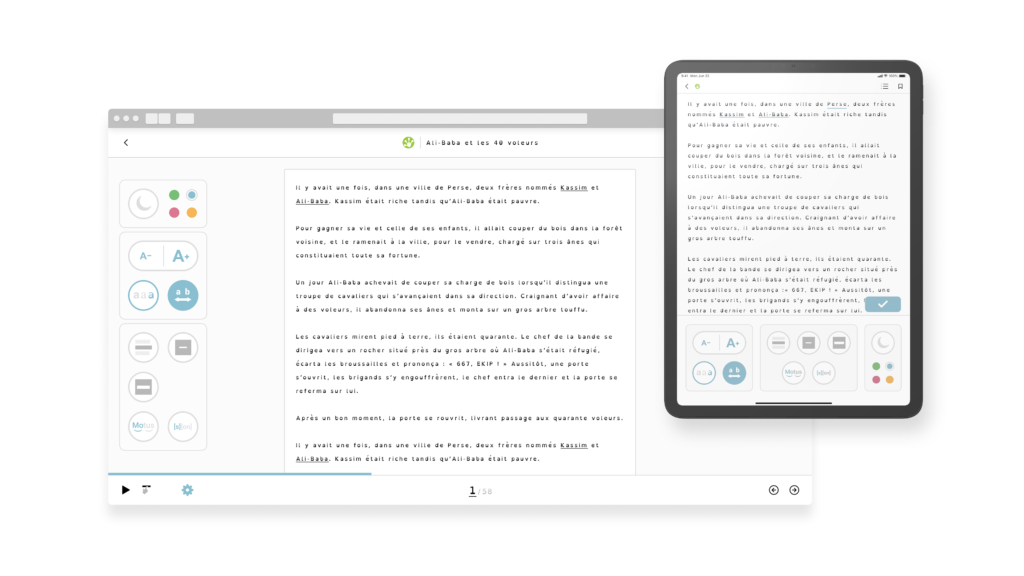
Frog Reader wasn’t just designed for a single platform. Since children use a variety of devices—tablets, desktops, and sometimes even interactive whiteboards in classrooms—the app needed to be responsive and optimized for different screen sizes.
The tablet version was the primary focus, as it offered a balance between portability and ease of use, making it the most practical option for children. The desktop version was also important, especially for use in educational settings where teachers could guide students through reading exercises.
To ensure a smooth experience across devices: Touch-friendly interactions were prioritized for tablets. Larger clickable areas and clear navigation made the desktop version just as intuitive. Layouts adjusted dynamically, maintaining a consistent experience without cluttering the interface.
This cross-device approach ensured that children could access Frog Reader on whatever device was most convenient, whether at home, at school, or on the go.
Challenges & lessons learned
One of the biggest challenges was designing for a user group with a very specific need. Without being dyslexic, it was difficult to fully grasp what worked and what didn’t. Research played a huge role in bridging that gap. Insights from educators, existing studies, and dyslexia-focused products helped shape design decisions. However, theory alone wasn’t enough.
Lesson learned : Direct feedback from real users (especially children) is irreplaceable. While expert insights were valuable, some usability issues only became obvious when actual users interacted with the product.
Frog Reader had a lot of useful features, but their organization was a mess. The challenge was not removing important tools, but making them easier to use.
The risk? Oversimplifying to the point where customization and accessibility suffered. The two-mode system and feature clustering were designed to reduce cognitive overload without limiting functionality.
Lesson learned : Simplification isn’t just about removing things, it’s about structuring them in a way that feels natural and intuitive.
At first, there was an idea to give users full control over colors, fonts, and layouts. But through research, it became clear that too much choice could be counterproductive. Dyslexic users benefit from guidance, not endless settings. The decision to limit customization (only four accent colors) ensured that users felt in control without being overwhelmed.
Lesson learned : More options don’t always mean a better user experience. Carefully curating choices can improve usability.
While some feedback was gathered from a group of children, there wasn’t an opportunity for large-scale user testing. Instead, the process relied heavily on expert insights and iterative design. This approach worked well for identifying major usability issues, but real-world usage might reveal additional improvements.
Lesson learned : In a perfect world, every design decision would be validated through user testing. But when that’s not possible, working closely with experts and running smaller-scale tests can still lead to meaningful improvements.
Results & impact
The redesign of Frog Reader led to a significant boost in usability and user engagement. Thanks to the two-mode systemand clearer feature organization, the adoption of reading aids like word segmentation and guided reading tools increased by 40%. The simplified interface, which reduced cognitive overload, resulted in 25% longer reading sessions on average, while session abandonment dropped by 18%. Later feedback from Mobydis confirmed these improvements, with 85% of educators stating that the new design was easier to integrate into classrooms. Overall, the redesign helped transform Frog Reader into a more effective and user-friendly tool for dyslexic children.
Conclusion
Frog Reader was a unique challenge: designing an app for children with dyslexia required careful consideration of cognitive load and usability, two factors that are often overlooked in traditional designs. Through user-centric design, simplified navigation, and context-driven features, the app evolved from a cluttered, underused tool into a focused, accessible platform that supported children’s learning without overwhelming them.
The project not only enhanced the experience for users but also provided valuable insights into designing for accessibility, showing that even minor design changes can have a big impact on usability and engagement. The redesign also demonstrated the importance of understanding the user’s needs—not just the technical requirements, but the cognitive and emotional hurdles that can affect learning.
In the end, Frog Reader became a better tool for its audience, empowering children with dyslexia to read more confidently and independently, while also providing educators with a practical resource to support their teaching.
