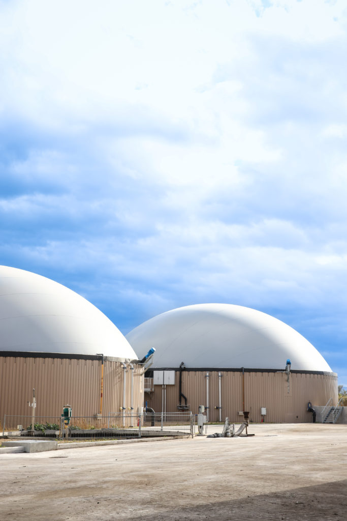
How to promote green energy by making biomethanization more accessible for
french farmers?
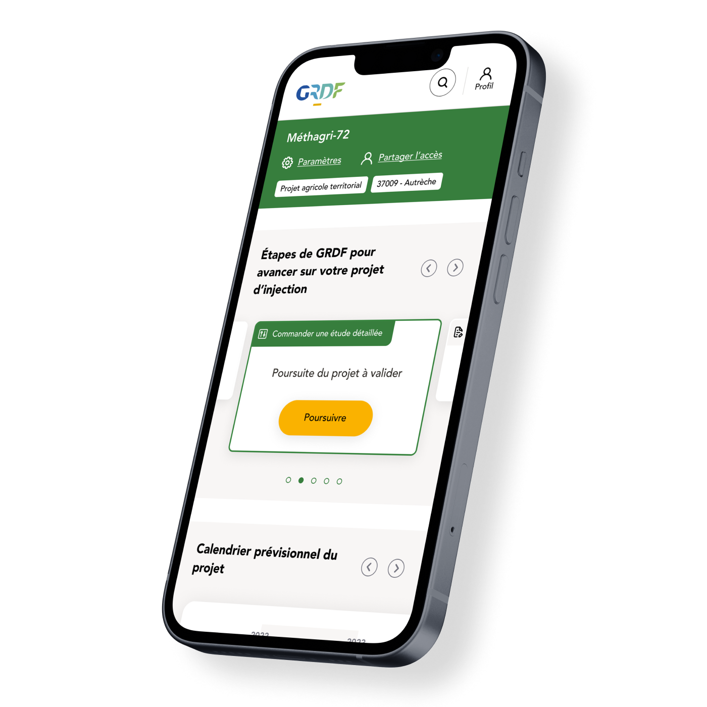
Introduction
First big question would be “what’s biomethanization?”, right ? Great question indeed.
Methanization is a natural biological process that breaks down animal or plant organic matter in the absence of oxygen, thanks to the action of various microorganisms.
It fits fully within a circular logic: it enables both the treatment and reduction of organic waste volume, the production of local and renewable energy, and the creation of a local economic dynamic through short, regional loops.
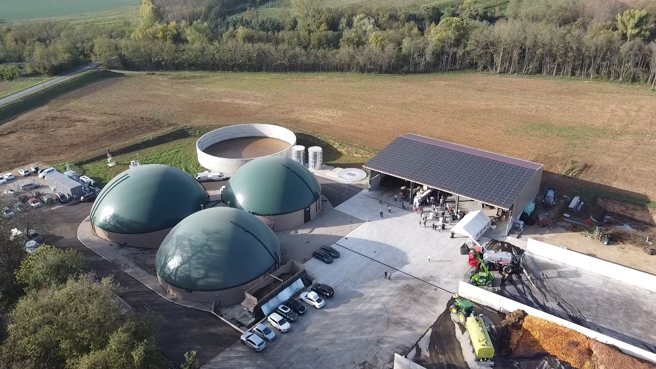
And so, what is the biomethane sector in France? It offers farmers the opportunity to set up biomethanization units on their farms. Literally small factories designed to create biogas from their animal or plant organic matter.
And in all of this, why did GRDF contact us?
To accelerate the development of the biomethane sector by designing a service platform for farmers.
The goal was to:
- Help them better understand the agricultural, economic, environmental, and local benefits.
- Guide them step-by-step through all the procedures necessary to implement their unit.
- And finally, support them in monitoring and optimizing their production.
But why does this require facilitation?
Well because it’s quite long, a bit complicated and frankly quite discouraging if you’re not entirely sure of what to do and when.
Hence the need for a digital platform that’d tell them exactly what they need to do from an administrative and legal standpoint and monitor their production later on.
User research & problem definition
To develop a solution that truly met the farmers needs, we knew we had to dig deep into their experiences with biomethanization. We started by interviewing farmers in the early stages of setting up their units. For a lot of them, the administrative side was a constant struggle: they described feeling lost in a maze of permits, regulations, and forms, with little guidance or support. They often weren’t sure what documents were needed, which approvals to get first, or even where to go for help. One farmer mentioned feeling “completely on his own”. This sense of isolation and uncertainty was often met, and it became clear that a lack of support in the setup phase was a major dealbreaker to getting projects off the ground.
We also spoke with farmers who had successfully launched their units and were now managing daily operations. These farmers shared another set of frustration: the tool available to monitor and optimize production was outdated and anything but user-friendly.
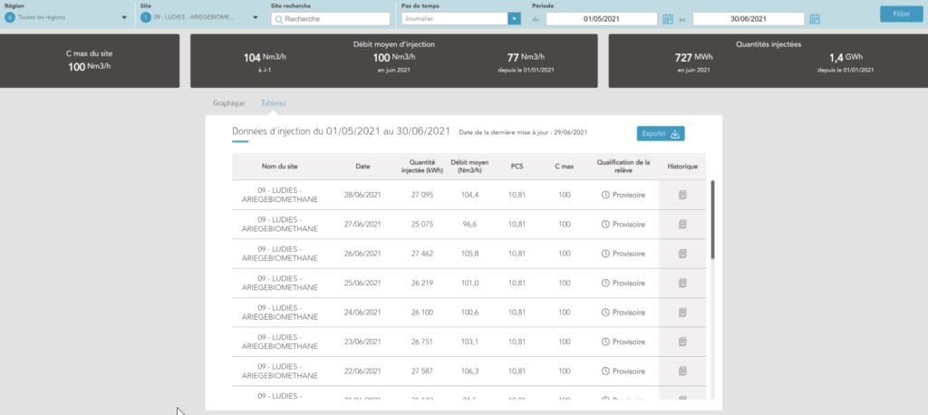
Others were doing it themselves with excels sheets, requiring them to pull information from multiple places and put them together. As one farmer said, “I know there’s potential to optimize my production, but I just don’t have the right tools to see the full picture.” This meant they were missing out on valuable insights that could make their operations more efficient and profitable, all because the existing platforms were too inconvenient or limited.
From these insights, we saw the opportunity to bridge two major gaps: offering clear, step-by-step support to guide farmers through the administrative setup, and providing an efficient, modern dashboard to help them track and improve their production. These interviews became the foundation of our design process, leading us toward a platform that could both simplify the start-up phase and make long term management intuitive and effective, one step after the other.
Design process
Given that we weren’t (yet) quite acquainted with biomethanization, it was crucial to stay in constant, close contact with the farmers throughout the design process. This allowed us to ensure that we were addressing their real pain points, rather than making assumptions about their needs. By involving them from the very beginning, we could iterate quickly, adapt to their feedback, and make sure the product truly served its purpose.
Teamwise, it consisted of a fellow UX designer colleague, myself, a product owner on our side assuring the dialogue between us GRDF and the devs and a product owner on the GRDF side.
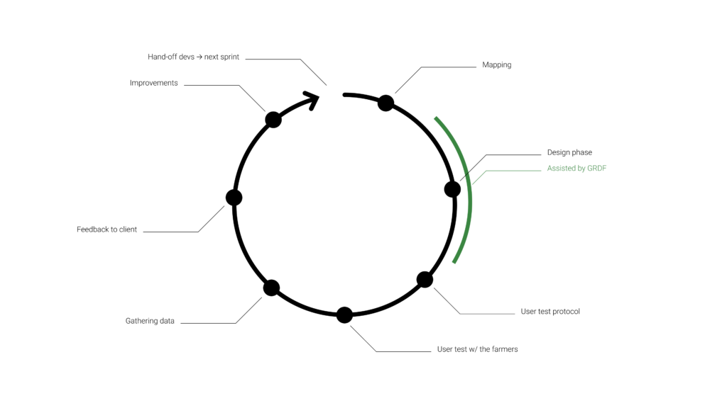
The project being huge, we adopted an iterative approach, breaking down the design phase into smaller, manageable pieces through sprints. This strategy was essential to handle the complexity of both the setup and monitoring phases, as there were a lot of features to develop and refine as we were going.
Each sprint followed as such:
Mapping: We started each sprint by mapping out the features to be developed, prioritizing them based on our users needs and GRDF’s goals.
Design phase: During the design phase, we worked closely with GRDF’s product owner and product team, ensuring alignment with their vision and getting their input on technical and business requirements. They helped us ensure the design would be feasible and relevant.
User test protocol: We then wrote a detailed user test protocol, outlining the scenarios and tasks we wanted our users to complete during testing as well as the questions we had for them. This ensured that our tests were purposeful and provided useable feedbacks.
User testing: With the protocol in hand, we conducted user tests directly with farmers. These sessions provided precious insights, helping us understand how they interacted with our work, what features worked well and what worked not so great.
Gathering data: After each round of testing, we carefully analyzed the data, looking for patterns in feedback and behaviors. This allowed us to identify pain points and areas for improvement.
Feedback to client: We then shared our results with GRDF, presenting both the good and the less good. This helped them stay informed and gave them the chance to provide feedback and additional direction.
Improvements: Based on the user feedback, we made necessary improvements to the design, refining features and addressing any issues identified in testing.
Hand-off to devs: Finally, after refining the design, we handed it off to the development team to begin the build process. And finally, we would move on to the next sprint. The idea was to always stay ahead of the development team so that they always had something to work on.
This approach allowed us to tackle the complexity one step at a time, while remaining responsive to the farmers feedbacks. It also ensured that the product was evolving based on real users input, and that we could adapt to any challenges coming our way.
Product design & features
So, remember when I mentioned that the build process was long? I mean really long (see below). On average, it involves about 4 to 5 years of development and construction and millions in investment. It’s a maze of forms and permits that need to be completed and submitted, one after the other. It’s easy to get lost.
Therefore, as mentioned earlier, it was crucial to break the entire process into manageable steps and provide support for our users along the way.
I’ll take you through each phase, breaking down the features and design choices that make the platform easy to use and effective for farmers.
To make the setup process less overwhelming, we built guided steps that leads farmers through each task, one step at a time. Instead of a giant checklist, we kept it simple.
When farmers first arrive in their personal space, they start by entering the name of their unit, and then the journey begins.
The very first form they fill out verifies project eligibility. This step helps us learn a bit more about them and, importantly, ensures that their future unit is close to the gas injection network. A crucial factor, as their production will eventually be fed into this network.
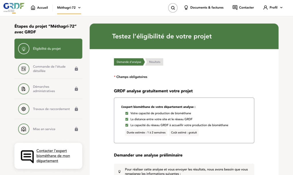
To keep things transparent, every form starts with a brief explanation of why GRDF needs the information and how long it will take to process. Forms can be tedious, but understanding their purpose helps reassure farmers that progress is being made.
A breadcrumb trail is also always visible, so they know exactly where they are in the process.
This is the first time they’ll encounter the chapters on the left side of the screen, which will remain visible on all form pages. These chapters span the entire journey, from the creation of the unit to its launch once construction is complete.
Each chapter contains several steps, giving farmers a clear overview of where they stand in the process of building their unit.
Fast forward a few weeks, the project is feasible! Hooray!
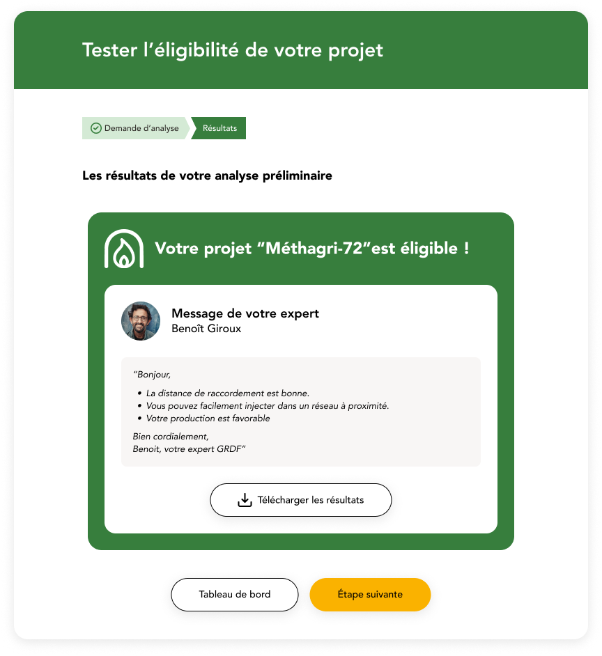
So, that’s done, what next ? A whole lot!
At this step, farmers have to pick between two studies: a feasibility study (optional) and a detailed study (mandatory). We wanted to make it obvious which one is essential, while also giving them all the information they’d need to make a choice.
To do this, we used visual hierarchy to set the detailed study apart as the required option. It’s got a bolder look in order to catch the eye first and make it clear that this is the mandatory choice. Meanwhile, the optional feasibility study looks lighter and less “important”, signaling that it’s optional.
We also wanted full transparency on what each study is for and how long it takes, so there’s a quick explanation up top about each one. Plus, we included a study breakdown right below each title card, so they have all the details of what they’re paying for.
We added a dropdown where they can specify if they’ve already completed any other studies beforehand as it can reduce the cost of those two studies.
Finally, between the top explanation of the study and the studies cards, a help bubble can be found which invite them to contact a GRDF advisor if they ever feel lost. Those bubbles will be found all over the product to give them helpful tips throughout their journey.
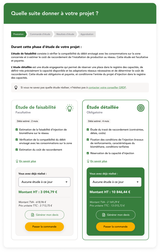
At this step, the user can choose the feasibility study, but to move forward, they’ll eventually need to select the detailed one. After ordering it on this screen, they’ll have a form to fill out so that GRDF can gather all the information needed to carry out this crucial step.
Once the form is complete and sent, the user will see this interface:
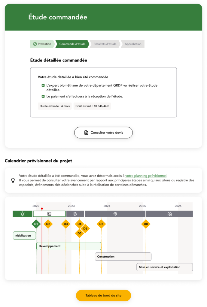
Once a farmer places an order for the detailed study, he gain access to a personalized progress tracker. Here, he can see each phase broken down over time, with clear indicators for key milestones, the tracker will accompany him all through the journey. The D1 is the study he juste ordered, each and every D is an important step that’ll take him to the launch of his unit.
His very own dashboard is also ready from now on, he’ll be able to access it through the CTA at the bottom of the page.
Let’s break down the main features of the dashboard:
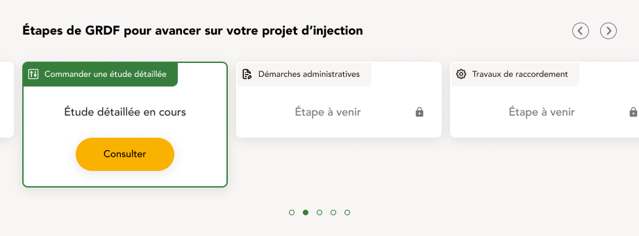
At the top of the page, farmers can see the different steps they need to complete. Previously completed steps are accessible for review, while the current step is highlighted for easy reference. If the user is in a waiting phase, the card will indicate that the step isn’t ready yet, but once it becomes available, the CTA will prompt them to move forward. They’ll also receive an email notification and an in-app alert when the next phase is ready. Although future steps are locked, they’re still visible, giving users an overview of what’s coming up in the process.
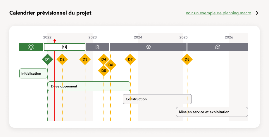
As mentioned earlier, here he’ll find his progress tracker, which evolves as he advances in his journey. Each step represents a new milestone to achieve. For example, D1 is the submission of the detailed study, while D2 is the reception of the results that confirm he can move forward.
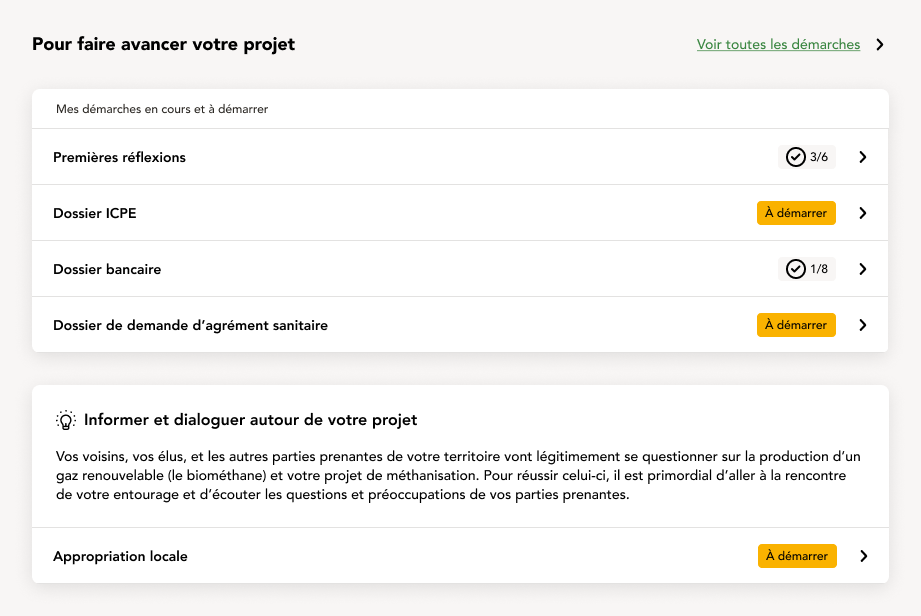
These are tasks he can work on alongside the main project as it progresses. They cover topics that will be important later, or non-mandatory subjects that could be useful to address. Additionally, this section provides documentation and guidelines on how to communicate about the project to local residents in the area where he plans to build. Biomethanization units, for example, often have a reputation for being noisy or smelly, when in fact that’s not true!
This section evolves as the project goes along, proposing different activities and documentations.
With the core features of the building phase covered, the rest of this stage primarily involves a series of structured forms and documents to upload.
After filling out what needs to be filled out, uploading what needs to be uploaded, you’re almost there !
One last little phase for construction work:
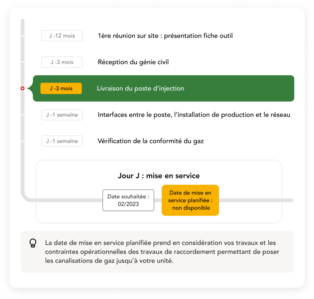
And you’re finally all set! Congratulations, it’s been some work…
The farmer will soon receive an email with a link to create and onboard his new account and begin the next part of his journey.
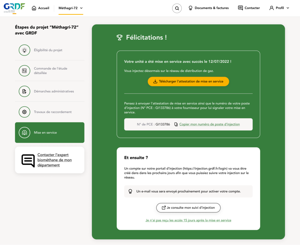
To wrap up the build phase, while much of this part of the product consists of filling out forms, it serves an essential purpose. Each form is a step forward, providing farmers with guidance and support through the journey of creating their biomethanization unit. By breaking down the process and offering clear steps, the product becomes a valuable companion, ensuring that farmers feel supported as they bring their project to life.
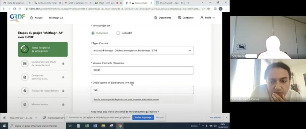
It was incredibly rewarding and essential to have interviewed so many farmers throughout the project. Getting their firsthand perspective gave us a clear sense of their challenges and needs. These insights helped us shape the product to actually fit into their workflow, making sure it felt intuitive and relevant. Plus, their feedback was invaluable in helping us anticipate potential roadblocks and simplify areas that could’ve easily been overwhelming. All in all, those conversations were a huge factor in keeping the project on track and building something that truly works for them.
Now that it’s all said and done, our users can shift focus to the monitoring phase. This is where the data insights and controls come into play, allowing farmers to manage their production efficiently and make data-driven adjustments. Let’s dive into how this monitoring experience is crafted to empower users in their daily operations.
Fast forward, it’s been a few weeks that your unit has been built and that you’ve been wired to the gas network, your unit is up and running. You log on your dashboard to see how it’s going.
This is what you see:
Let’s break it down by features, starting with the graph
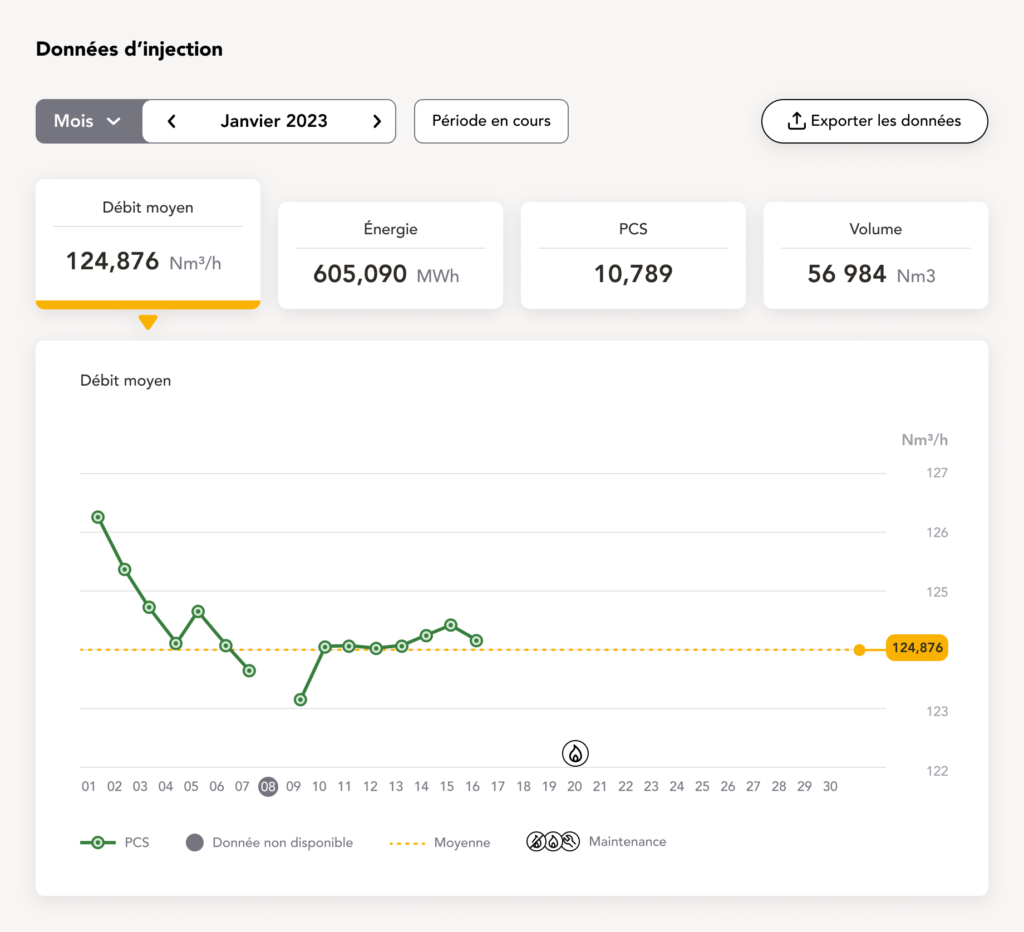
The core feature, the main reason farmers log in each day.
This part of the dashboard gives farmers a clear view of their unit’s gas injection performance. Right at the top, key metrics like average flow rate, injected energy, calorific value (PCS), and total volume are front and center. The first presented is always the average flow as it’s the most important, they can always click on the others values to switch graph.
It’s a straightforward snapshot of their production, updated daily so they can track progress at a glance.
The dotted line highlights the monthly average, giving context to individual fluctuations, while icons mark any maintenance events that could explain changes in output, I’ll get back on this subject later on.
If farmers need a closer look or want to share data with a third party, they can easily export this info with the “Export Data” button at the top. The goal of this interface is to transform a vast amount of data into insights that are easy to understand and act on at a glance.
By glancing over the dots, you’ll be able to obtain some details about the specific data of the day. If it’s during the current month, the data is temporary until confirmation by GRDF the month after.
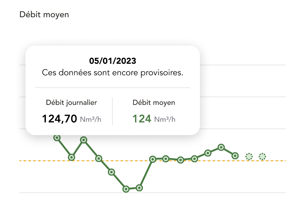
Whenever they select a previous month on the selector right above the graph they’ll be able to consult the previous data of their units:
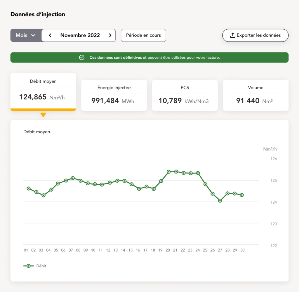
In this specific case we’re 2 months in the past so the data is set and permanent, indicated by the green message right above the data selector.
Now I’d like to slightly go back to when I was explaining that farmers were having a hard time gathering data about their units. They can now consult through the graph but a reason why they want to gather it is to invoice the third party buying the gas, GRDF only provides the network. Which is why for the past months, where the data is permanent, we designed an invoice module to help them retrieve the right numbers to ease out the process:
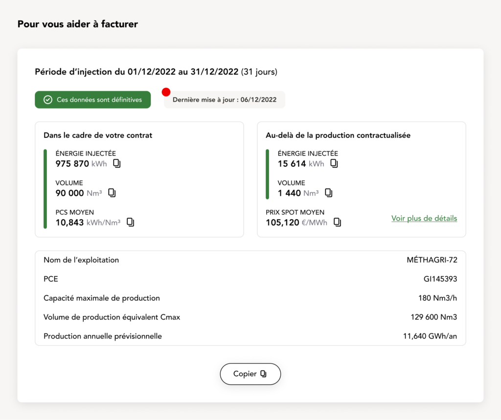
Here they’ll find all the essential data of the energy they produce within their contracts (called the CMAX) and the surplus they may have produced. They’ll also find the average price of the gas at the moment, but more on that later.
Now back to the present, another technical pain point we discovered is that, as I mentioned, they can sometimes produce more than what’s specified in their contract. Which can obviously be beneficial for them right? More energy, more money. But not always, if the spot price is low at the time they’ll actually lose money.
Back then, it was quite the hassle to triangulate all the data to determine if they had an opportunity to produce more to gain more. Hence why we proposed this production simulator:
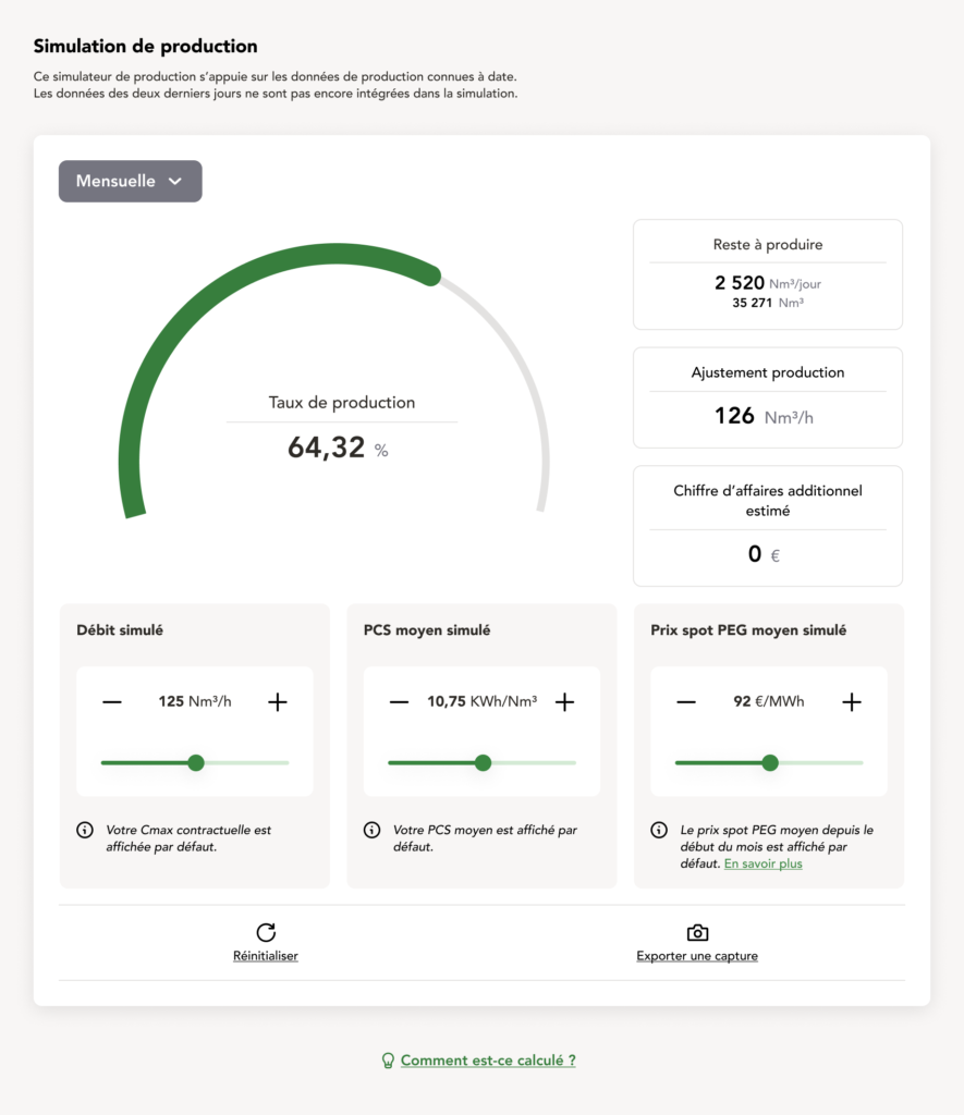
The big wheel is where you’re at at the given moment on the month, and what’s left to produce to hit your CMAX. A few datas can be found on the right hand side to precise what’s left to produce and the production adjustment you have to maintain to hit the contractuel goal.
And right beneath is where you can play around. What if you up the flow, with a high quality gas (PCS/HHV, Higher Heating Value, measures the total energy content in biogas, indicating its suitability for injection into the natural gas grid.) and with a good spot price ? Well you’ll make some additional sales, which will appear right beneath the production adjustment on the right hand side.
This simulator was really well received during testing. Farmers appreciated the control and insight it gave them, allowing them to make informed decisions about their production strategies. By putting this data directly into their hands, we helped reach new revenue opportunities. This feature not only supports their financial goals but also deepens their understanding of how to navigate the biogas market.
Finally, one of the most crucial additions to the homepage addresses a recurring frustration: maintenance operations. Farmers told us it was common for GRDF or third-party teams to either give last-minute notice or no notice at all before performing maintenance. Since these operations often require a temporary cut-off in gas injection, farmers would sometimes have to shut down their entire unit for a day without adequate preparation. Adding to this, there was no straightforward way for farmers to log their own maintenance needs; reports often went missing or never reached the right people. It was clear that a dedicated feature to simplify maintenance communications was essential to making their lives easier.
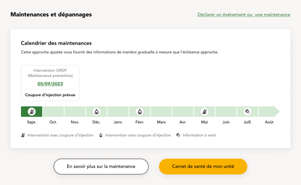
This maintenance calendar gives farmers a preview of the full feature we’ll dive into shortly. It shows the next 12 months and marks every scheduled maintenance. Icons on each date indicate whether a cut-off will be required, isn’t necessary, or is still uncertain (typically for maintenance scheduled far in advance). Farmers also have the option to log their own maintenance directly if needed.
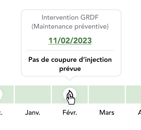
If hovered upon future a maintenance, a bit more information will be shown.
Alright, as always, let’s deep dive!
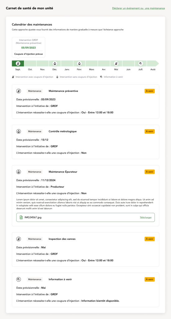
This “Carnet de santé de mon unité” page provides a comprehensive view of all upcoming maintenance activities for the unit. It’s designed to give a bit more information into what’s planned, allowing them to better manage their operations around scheduled maintenance.
The page starts with the same maintenance calendar we saw right before.
Below the calendar, each maintenance task is broken down in detail. Each entry includes:
- The maintenance type (e.g., preventive maintenance, inspection),
- The expected date of the intervention,
- The initiator of the maintenance (GRDF or the producer themselves),
- Whether a cut-off is required for the maintenance, along with a specific time window if applicable.
If the farmer declares a maintenance, it’s also the place for him to upload relevant documents, such as maintenance reports or photos, ensuring all related information is easily accessible and well-organized in one place.
You’re maybe wondering why the dates are less precise as it’s far in the future ? That’s because, if declared by GRDF, the furthest away the maintenance the less precise is the date.
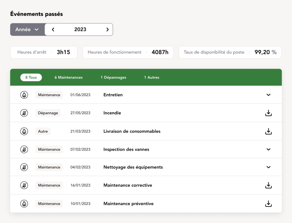
This “Événements passés” page provides a detailed record of all past maintenance and repair events for the unit. At the top, it offers an overview with key metrics: total downtime, operating hours, and availability rate for the selected year, giving a quick snapshot of the unit’s performance.
Below, a list organizes each event by type (maintenance, repair, other……) along with the date, event description, and a download option for detailed reports. This setup allows farmers to easily review the history of interventions, track recurring issues, and access necessary documents, ensuring they have full visibility into their unit’s maintenance history.
With these maintenance features, farmers have a clear view of what’s coming up. Our testers loved the fact that they could plan around scheduled maintenance way in advance. Knowing when they might need to shut down for a day or so meant they could adjust production ahead of time to offset any potential downtime. It’s a small change, but it makes a big difference to their workflow and peace of mind.
And just like that we’ve seen all the features on the home page!
Let me introduce you to one last feature, and for that, let’s rewind a bit to where we talked about the production simulator. As we know by now, the gas spot price is a key piece of data to consider. That’s why we decided it deserved its own dedicated feature.
Sitting right above the user’s dashboard in the site map is the home page. It’s the first thing they see when logging in and serves as the central hub to access the dashboard for one, or multiple, of their units.
Here, the user can access all their injecting units (if they have multiple) and even their unit still in the building phase. There’s also a section for the latest news in the biomethanization world, plus some handy online tools and a forum to connect with other farmers.
But the real highlight lies just below the unit selection: the detailed breakdown of the spot price.

Right on the home page, they’ll get a quick snapshot of the current spot price: today’s price, the monthly average so far, and the trend over the past seven days. But the real deep dive happens when they head to the full page:
Here, they can dive into a detailed graph that highlights the gas price fluctuations over the current and previous months.
This feature earned its own dedicated page because, during our initial farmer interviews, we uncovered an interesting insight: checking the spot price was part of their daily routine, literally the first thing they did every morning.
So, to make this ritual easier and more efficient, we introduced the ability to set custom alarms. Now, when the price hits their target, they get notified right away. No more constant manual checks, just actionable updates when it matters most.
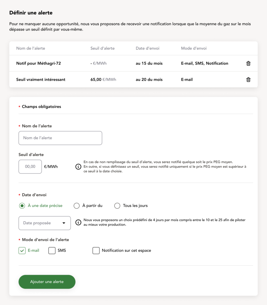
Here, they can customize their alert by naming it, setting a price threshold, choosing when to receive it (specific date, from a specific date, or daily), and deciding how they want to be notified.
If they leave the threshold blank, they’ll simply get a notification with the spot price on the selected date. But if they set a price, they’ll only be notified if the threshold is met on that day. This way, they avoid being overwhelmed with unnecessary emails, texts, or notifications, just the right info at the right time.
While the production simulator helps farmers make strategic decisions by projecting potential gains from overproduction based on gas prices, this alert system is all about convenience and real-time updates. Instead of analyzing or planning, it’s designed to keep farmers instantly informed when prices hit the levels they care about, so they can act quickly without constantly checking the dashboard. It’s about simplifying their daily routine while keeping them informed.
And that’s a wrap on the product design! While there’s even more to explore within the platform, I’ve showcased the most essential and impactful features. Beyond the MVP, the injection graphs, we designed each tool to address specific needs brought up by the farmers themselves. From simplifying the build process to helping them make informed decisions during production, every feature has been shaped by their feedback. User testing confirmed what we hoped for: this platform isn’t just a tool; it’s a true companion for their daily work life, helping them navigate challenges and make the most of their biomethanization units.
Challenges & lessons learned
Looking back on this project, it’s clear that it wasn’t just about designing features or building interfaces—it was about navigating a bunch of challenges while keeping the farmers’ needs front and center. From the beginning, we knew this wasn’t going to be a one-size-fits-all product. The farmers we interviewed had wildly different workflows, experiences, and even expectations for what the platform should do. Some wanted everything automated; others preferred keeping a bit of the old-school touch. Balancing what they wanted and what was possible technologically speaking was a real puzzle.
One of the biggest challenges? Making something as overwhelming as the unit creation process feel manageable. Splitting it into clear steps and wrapping it in a guided experience took a lot of trial and error, but the result spoke for itself during the tests. Farmers actually felt like the platform was on their side—and that’s exactly what we were aiming for.
The gas spot price and production simulator features? They were born out of listening. We didn’t sit around guessing what users might want; we went out there (on google meet), asked them what they cared about, and got our hands dirty understanding their day-to-day.
Of course, not everything was perfect. Some users had feedback that showed us we still had room to grow, whether it was simplifying navigation for multi-unit producers or making the graphs even more intuitive. But hey, that’s part of the process. It’s not about pleasing everyone but about building something that genuinely makes life easier for most.
This project taught me a whole lot, not just about product design but about listening, adapting, and always keeping the human side of things in mind.
It was also fantastic to witness such a large project from beginning to end. I was there for the first client meeting, working with the developers to see our work come to life until the launch of the first part of the product.
Throughout the process, we made sure to keep farmers at the center of every design decision. Hearing directly from them during user testing was invaluable. One farmer shared, “The dashboard makes it so much easier to keep track of everything without having to juggle papers or spreadsheets. I just log in and get an overview of where I stand.”
That kind of feedback showed us we were on the right track—creating something practical and time-saving. Another farmer put it this way: “I feel like this tool really understands what we go through on the field. It’s practical, straightforward, and saves me a lot of time.”
Of course, not everyone saw it the same way. Some users pointed out areas for improvement, like one farmer who said, “It’s a great platform overall, but some parts still feel a bit clunky—like navigating between units if you manage more than one.” Others admitted they weren’t ready to let go of their traditional methods entirely: “I see how this can help, but honestly, I still prefer to handle things the old-fashioned way for some tasks. It’s just what I’m used to.”
These insights reminded us that while the product resonated with many, there’s always room to refine and adapt. It’s a continuous process, and hearing these voices helped us build something genuinely useful.
It was incredible to witness such a massive project from start to finish. I was there from the very first client meeting, collaborating with the developers to see our designs come to life, all the way to the launch of the first part of the product. Being involved at every step taught me so much—not just about the complexity of designing for real-world users but also about teamwork and adapting to challenges along the way. It was a real reminder of why I love this job: solving problems that make an actual difference.
Conclusion
This project has been one of the most rewarding experiences of my career so far. I learned that no matter how much effort you put into understanding user needs and refining every detail, you simply can’t please everyone. And that’s okay. What matters most is creating a solid product that works for the majority, and I believe we accomplished that.
Designing something with a purpose as meaningful as supporting green energy and contributing to the energy transition made every challenge along the way feel worthwhile. It’s a rare and fulfilling opportunity to know your work could have a positive impact beyond just the immediate users.
If I have one regret, it’s not being able to present concrete KPIs or metrics to evaluate how the product is evolving now that it’s in the hands of the users. I’d love to have been part of its continued growth, adapting and improving it based on farmers feedback, but my role on this project has come to an end.
I’m deeply grateful to the amazing team I worked alongside, to GRDF for trusting us with such an ambitious project, and especially to the farmers who shared their time and insights with us. It’s been a true privilege to be part of something bigger than just a product: a step toward a greener future.
