AsieOnline.com redesign
CLIENT Asie-online.com, School project
ROLE UX/UI, Audit
SOFTWARE Sketch, Overflow
DURATION November 2018
Brief / Context
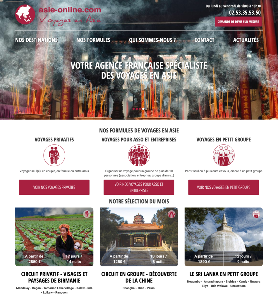
The brief was to improve the image and branding of the French travel website Asie-online while improving the user experience and reservation process. They offer a great service but unfortunately their website is a bit old looking and their user experience is chaotic. Their cost estimate form was also too long, it’s a decisive point to get customers and they might lose some with a bad form.
Created in the late 00’s at an era where UX designers weren’t a thing yet a lot of websites hadn’t what we would call today a “user friendly experience”. The site is filled with CTA to increase the SEO but leaves a quite chaotic page. Users nowadays are used to experiences such as Airbnb of Uber, simple and straight to the point. Which AsieOnline fail to achieve.
From an graphic design identity point of view, AsieOnline is also lacking something more modern. The old looking red and the low quality visuals gives the impression of a poor quality service.
Redesign
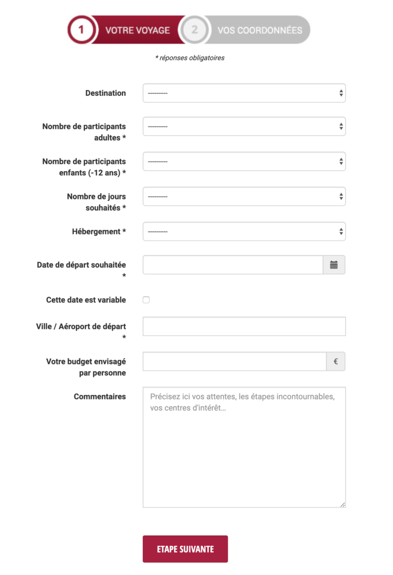
The UI suffered quite some problems, lack of contrast, badly organized content and not enough breathing space etc. But one of the main problem was the form design. They have a big CTA proposing a free cost estimate, but upon arriving on the actual form it is huge. It’s long, and it looks long to the user which makes the conversion rate drop significantly.
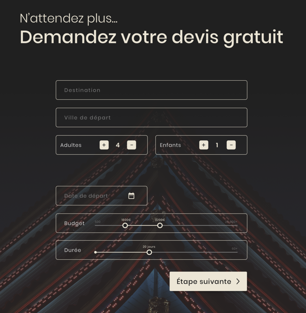
A better designed form directly at the end of the home page would allow new customers to quickly try to build their own custom trip and increase the conversion rate of the website.
That’s why I decided to put an easier and more visual form right at the end of the home page.
A big part of the work was to reorganize the landing in order to make it more appealing. Indeed the existing one was way too crowded, I tried to divide it meaningful sections with fewer CTAs to make the interactions more clearer for a given user.
UI & branding
For this project, I used the software Sketch to design mockups for the new version of the website. The old colorway was entirely replaced by a cream white and a warm black in order to give the website a more luxurious identity.
A big thing that the existing website lacked of was also quality visuals, they were quite poor and weren’t giving a unity impression overall. I chose higher quality pictures and coherent with one another.
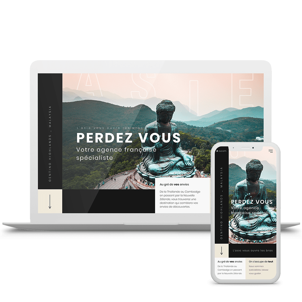
The image below features the first thing you see when you arrive on the website with a description of what Asieonline is and right below a quick recap of what they propose.
A more luxurious look
The use of more blank space, new colorway and patterns gives a more modern and luxurious look to the website.
Every month, asieonline proposes a monthly selection of their best destination presented below.
The client testimonial becomes a travel diary where previous customers talk about their experience with asieonline in a fresh and modern look. As seen previously the page ends with the redesigned cost estimate form.
Mobile version
Overall
It was a really interesting project with a lot of work to do. I think that overall the UX and the brand identity has been improved through my proposition. Some regrets I have regarding this project is the short time we had. I would have loved to continue improving my work and run some tests on actual users.